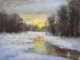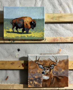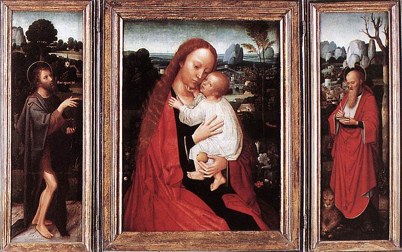
Triptych art is made up of three panels that are intended to be displayed together. A triptych is from the Greek adjective τρίπτυχον meaning “three-fold”.
The first triptychs were from early Christian art, which were a popular format for altar paintings from the Middle Ages onwards. Today triptych art is still defined as a work of art, usually panel paintings, digital art or photography divided into three sections.
When the triptych art form is applied to photography or fine art, there are no steadfast rules to a triptych display. One method consists of three mounted artworks in a frame, the 3 images are closely associated in subject matter and are displayed near each other. Alternatively the triptych can be a collection of three pictures featured in a singular image.
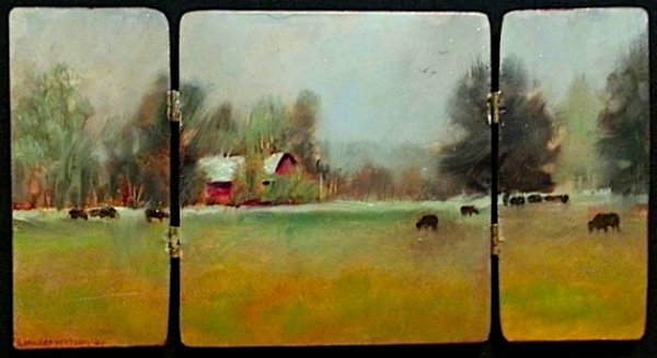
Triptych art as a form is frequently used as a decor element in various interior design spaces. They can be beautifully placed in homes, offices and hotels.
The artist’s vision is paramount. As an artist, I can truly express my style or message in a much broader sense with a triptych image. There are no real rules in Triptych art and photography, anything goes.
I love working with these digital triptych’s. Something about working with three images in a single long artwork appeals to me. After I become rich and famous, I believe these works will be the reason why. Here are the three points that I have highlighted as to why I believe they are a successful vehicle for an art installation.
1. Great visual appeal: These images have an aesthetic appeal to them. They challenge the viewer to think about the design and challenge themselves to the meaning and movement of the piece. As the viewer looks from one panel to the next, they have to come to terms as to how the art speaks to them and how they can digest three different artworks in one composition.
2. Color: The color does a nice job of leading the eye from one of the images on the left to the ones going right. The subtle color of the first illustration to the blue tones of the second on to the thinner lines of the 3rd keeps the piece interesting . I believe these contemporary artworks do a better job than photo’s in the triptych format because I can alter the colors and transition of the piece. Unlike a photo which is basically one image cut into three sections.
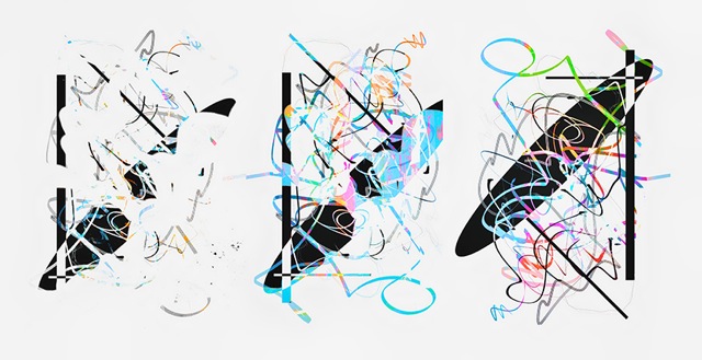
3. Great Wall Coverage: The problem with a lot of decor art today is you don’t get much bang for the buck. In other words, if you are going to invest in an artwork, you want it to cover some wall space. This triptych is a big enough file that it can be printed up to 6 feet long by 3 feet high. As long as the aspect ratio of 2 to 1 is adhered.
I’m sure you are asking yourself, what does this contemporary artwork mean anyway? I will try to give you my two cents worth. I like to work with the theme of transitions. I start with one simple design, then the second one becomes more complex – like how our life becomes more complex as we grow and reach our productive years. The final segment is when we have it all together or at least, that’s how it appears. Then we reach our maturing stage of life when we evolve again. Maybe not quite the way we had hoped but somehow we make it work.
Guest artist/author: Marc Garrison is an abstract photographer who enjoying digital technology and filters to enhance his images. He uses photography to express his love of the natural world.
* Thank you to Marc for an interesting guest post! Thanks for visiting FineArtTips.com. You can see my art on my website, LoriMcNee.com, and let’s meet on Facebook Fine Art Tips Facebook Fan Page, on Twitter, Google Plus and on Pinterest. Be sure and check out and my fine art prints and notecards on Fine Art America.! ~Lori


