This guest post by ArtWeb.com is very informative because they currently host over 10,000 artists’ websites, so they know their stuff. As website experts, they have noticed several common website mistakes artists make when creating their sites. This post highlights the most frequent mishaps and how to avoid them.
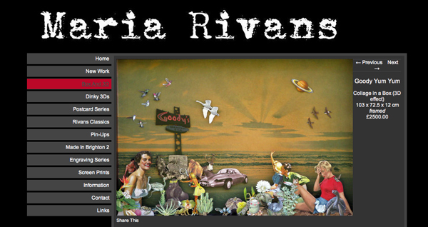
1. No prices or artwork information
If you want someone to buy your artwork, you need to let them know how much you’re charging. It’s a simple rule that happens everywhere, from market stalls to high-end retail stores. Here are few reasons why:
- Without an idea of pricing, customers will be immediately put off. You might think that having a line saying ‘please enquire for prices’ is sufficient, but to be honest, you may as well not bother. With no way of getting an immediate response, you are making your customer do more work than they should, and this isn’t going to encourage them to part with their cash.
- You need to provide every possible bit of information someone could want. As well as pricing, this should include the dimensions, media, date created, whether it’s part of a series, if it’s available as a limited edition print, and so on. There should be no questions left to ask, because if there are, chances are your customer will be too busy to ask or simply lose interest.
- Include Terms and Conditions. Building trust with your customers is essential, so by including clear T&Cs you are portraying a level of professionalism that people expect to find.
Pricing your artwork can be tricky. If you aren’t sure how to do it, check out ArtWeb’s article on the subject here.

Artist Maria Rivans – a perfect example of how to provide all the information a customer might need to know.
2. Flash Intros
Now, I’d be willing to forgive some artists for wanting or having a Flash intro (or indeed any kind of intro) as their homepage, since us arty types aren’t known for being at the “bleeding edge” of technology. However it’s been a well-known fact since at least 2006 that everybody simply presses “skip intro”. Although Flash can be suitable for some situations (such as video or animation), there are several problems people can run into when it’s used unnecessarily:
- It can take forever to load. People get impatient with slow-loading websites, and are likely to leave before you’ve had a chance to show them what you’ve got to offer. Not really a great start to a successful artist/buyer relationship!
- ‘Flash player not available’ – Have you ever got this message when trying to view a website on your smart phone? This is a common issue faced by people who use iPhones and iPads for example, which don’t enable Flash. Lets face it, these are a pretty popular choice for many people in the creative industries these days, so it’s not worth the risk of alienating a large chunk of your audience.
- Search Engines also find it difficult to find Flash websites or Intros, so this won’t do you’re website any favors when it comes to search listings. One of the reasons for this is that the main thing search engines trawl for is text, and with Flash you aren’t including any text information.
- And don’t even think about having intro or background music
3. Poor quality photos
The quality of your images plays such a vital part in the impression people get from your website (and from you as an artist). There’s just no excuse these days for pixilated, poorly lit, or wonky photographs of your artwork. Here are a few things to think about:
- Use even lighting. The easiest and most effective way to do this is to take photographs of your work outside on a cloudy, overcast day. Bright sunshine will only cause contrasting shadows and alter the perception of texture in your work, whereas clouds act as a giant soft box, which diffuses the light evenly over your subject. Of course, make sure there’s some shelter nearby in case it rains!
- Straighten up! Go through all of your images and make sure none of them are lopsided – if they are, you can correct them very easily in Photoshop. It might seem like a small thing, but it’s the attention to detail that will build your reputation of creating quality artwork.
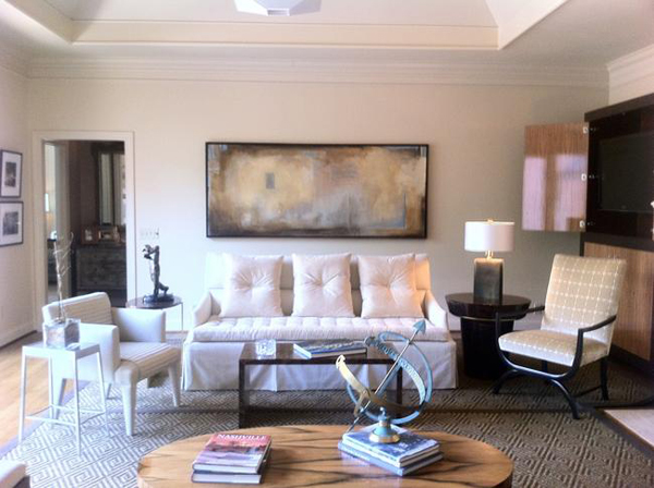
- Have multiple images. Remember, you’re probably used to seeing your art every day, and know it like the back of your hand… but a new client won’t. Having more than one image can really help convey how the artwork looks and feels. The main image should really not feel like a photograph at all, but a high-quality reproduction of your artwork. For the second image, why not hang the work in a room so people can imagine it in-situ within their home. A third image could zoom in on a section of the work, to show finer detail.

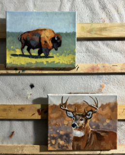
Image by Ed Nash
4. Slow loading times
Not only are slow websites frustrating for visitors, but did you also know that Google actually favors fast websites over sluggish ones? The most common reason for slow websites is having images that are far too big, and take ages to download. Here are a couple of points to consider:
- Resolution – Cameras today are capable of taking huge, high-res images. Generally you will need to use an image editing software (such as Photoshop) to optimize and scale down your images for the web.
- Stick to this rule – never upload an image to your website that is larger than you need. If you need to place a small image on your homepage that’s 300 x 300 px, there’s no need to upload an image that’s 1000 x 1000 px, only to then decrease the size in your HTML or web page settings. Again, this is something you can sort in Photoshop, Preview, or similar before uploading. Of course some website builders (like ArtWeb) will automatically resize and optimize images for you, but make sure you double check this is the case before you go ahead and upload large images.
- Make sure you aren’t uploading TIF files to your website, as these are a lot larger than their web-friendly equivalents – JPEGs or PNGs.
5. Not using a professional template
Artists often believe that because they are talented and creative in other fields, that designing a website will be easy. However, there are many things that go into designing a website (such as coding, scripts, etc.), which unless you are paying big bucks for a personal web-designer, likely won’t be achievable within your schedule. That’s why it makes sense to go with a professionally designed template, which may also give some freedom to manipulate the design and look of your site, but where all the tech stuff is already in place. This will include things like galleries, slide show functions, and navigation, as well as having someone to contact for support queries.
Your website should be about showing of your artwork, the design should take a back seat and only serve to compliment your work allowing the art to take centre stage. You don’t need to re-invent the wheel and come up with your own unique design (your artwork is already unique), a professional template will do a great job of displaying your work, plus it saves you time and money!
Guest author: Sara is an author on the ArtWeb.com Blog. ArtWeb helps artists build their own website, plus promote and sell their artwork online. The Blog is for aspiring and professional artists covering everything from approaching galleries to optimizing your website for buyer confidence.
*You can visit my WordPress art website, LoriMcNee.com, and let’s meet on Facebook Fine Art Tips Facebook Fan Page, on Twitter, Google Plus and on Pinterest. Be sure and check out and my fine art prints and notecards on Fine Art America.! ~Lori


An enjoyable experience is essential in building a relationship with someone when they visit your site, you never know they may become a buyer. All of the things mentioned are a big turn off, so thank you for the detailed solutions Sara and Lori.
Hello again John, thanks again for visiting and commenting again. Glad you enjoyed Sara’s helpful post.
🙂 L
Having just finished putting together my photo art website, I was frankly nervous about discovering these 5 big online artist mistakes in case–eek–I was guilty. But whew — I did okay. Except maybe for the last point. While I started out with a professional template, I made a huge amount of changes when designing my first non-art site. I then took that template and used a lot of it for my current site, which turned out to be an enormous amount of work. So I would agree with Artweb.com it’s smart to start with a template that will require minimal changes.
Pat, I do agree with you and have made some of those website mistakes myself. In fact, this blog started off as a little art blog and has blossomed into a huge blog that requires customizing. For the average art blogger, a template designed specifically for artists is the way to go.
Thanks for sharing,
Lori
Hi Lori , I have heard there is an app for putting a painting into a room like you have shown above. It helps a visitor get a sense of size/scale. Do you happen to know where I can find this app?
Thanks for your time,
Sue
Hello Sue, I will ask my app savvy art buddy and get back to you!
Walnut App might be what you’re looking for Sue: https://itunes.apple.com/us/app/walnut/id560843785?mt=8
Thanks for passing this app along!
Sue, I asked my friend Matt Le Blanc about the app…here’s what he said…
For your question, I don’t if there’s such app. I never seen it. I use PhotoShop but you can use any basic image software. Essentially, you buy a living room stock image and you set it up as you background image. You can then crop your painting and add some drop shadow and bevel effect which is common in any image manipulation software. You can slap your logo and voila!! You’re done. It’s fairly easy.
Hope it helps!
Matt
Thanks again for asking ~Lori
Good post. Having a professional looking website, with easy navigation and your prices clearly visible all subconsciously signal to the browser that you take your art – essentially, your business – seriously. As a result, they are more likely to take you and your work seriously, and get that much closer to making a purchase.
Great follow up comment, and very true. Thanks for stopping by.
I think a lot of artists feel the need to make their websites an extension of their artwork, and end up sacrificing ease of nagivation in favour of aesthetics.
When I visit an artist’s website, I don’t want to struggle (or wait) to find the gallery or biography. Just make it easy for viewers! If you’re unique and want the world to know it, let your artwork do the talking, not the code surrounding it.
Simple usually is best for the art website. So many online users are not savvy at navigating…thanks for stopping by!