
On color mixing, there are two rules I don’t agree with.
-
Don’t mix more than three colors together at a time.
-
Don’t use black in your painting.
Mixing “Mud”/Grays:
Muddy colors. We all hear about them, but what are they really? Do they look muddy because they’re gray. Or, are they just misused colors?
Some artists say if you mix more than three colors you will get mud. I’ve heard this many times and I disagree.
At the end of each painting session, I scoop my paint into a pile and save it for the next day when I need some grays. I will modify that paint to suite my needs. This is my “mud”. Mud will almost always have all the colors of my palette in it. That adds up to at least 7 colors – many more than the three I’m not supposed to mix together.
In order to have paintings that glow, that have a vibrancy to them, I need my MUD!
You’ve probably heard that grayed colors will make pure colors look brighter. Whatever it takes to get the right color of gray is the right thing to do. You don’t need a formula. You need to observe. Look at your pile of gray and ask yourself, does it need more red, green, blue, what does it need. What do I need to add to change the color, temperature or value. Add another color? Do it!
When someone says their painting looks “muddy”, it probably isn’t because some of the colors are gray. There may be other reasons. It may be because they have used the wrong color in a certain space, the temperature of the color may be off or they have worked two different values together when there should have been one value in a space.
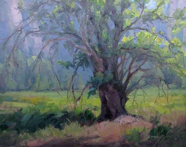
Brushwork can also make a difference in having a fresh look or a muddy look. When you muddle brushstrokes together, painting an area over and over instead of laying down nice clean strokes, the painting can look muddy.
“Mud” can look “fresh and clean” with strong, confident brushstrokes. Use enough paint on your canvas so that it doesn’t look weak and muddy
Another common fault is to add too much white to a color. Titanium white, which is opaque can make a color chalky or in some cases “muddy”. Some colors just can’t be duplicated exactly as in nature, such as a pink in sunlight. Instead of adding to much white and getting that chalky look, you may have to make a choice to use a pink with a little yellow in it and use your deeper, richer pink in the shadows.
So, don’t limit yourself to the rule of no more than 3 colors mixed at a time.
Observe values, color, and changes in color temperature. Learn about the colors you use and how to mix any color that you want. Also, don’t overwork your paintings. Learn to lay down a color and leave it alone. If it isn’t right, scrape it off and try it again
Using Black:
The other bit of advise I hear is to “never use black in your painting”. I think black like any other pigment has its place and use if it is used wisely. Now, I admit, I don’t use black often, but that doesn’t mean that it isn’t appropriate to use.
At times, I have used black to add to some of the dark colors on my palette. I modify the dark making it cool or warm, whatever is needed just as I would any other darks that I use. Black works very well with alizarine or viridian. I also have used black to gray colors, adding a very small amount of black to a color. It doesn’t take much. Black also makes a great warm green by mixing a yellow into it.
Now, a word of caution: I wouldn’t recommend black for the beginning artist. Black can be difficult to learn to use. When artists do use black, it is often overdone, a little bit goes a long way. I won’t say never use black by itself, but certainly don’t use it often or in excess in a painting.
Remember the rule, save your darkest dark (accent) and lightest light (highlight) for no more than ten percent of your painting.
It will be easier to break these “rules” once you have learned how to mix and use colors. Just don’t limit yourself by saying never.
Guest author/artist: Becky Joy is an artist, a painter, a teacher and an explorer who has achieved her lifelong dream of becoming a professional artist.


Hi Lori,
Thank you very much for these tips on colour. Your vases and birds glow! And there is a beautiful harmony between the bright colours and the “muddy” or more muted colours. I wish I could paint birds as beautiful as yours! And love your video btw.
Lucy
Hello Lucy, I recognize you from Twitter. It’s fun to see you stop by here too. Thank you for your nice words…
Great and succinct article!
I agree with everything you have said here. It seems to me that 1) we really need some greys and neutrals in our painting to make color work, 2) failure to clean the brush can often inadvertently cause muddy mixtures.
I’ve seen painters use nothing but browns: Burnt Umbers / siennas and other earth colors were the dominant “color” resulting in a very brown and dull looking painting.
I think the key is the balance of neutrals offset by clean color mixes and a few strokes of nice saturated color.
Nice article!
I usually use graphite more than anything, but I really like to paint but I always find myself getting my trees, and other elements too dark, I have even reverted to trying to buy pure red, blue, and yellow to hopefully brighten up my paints. I like this article and hopefully I can learn to get my colors brighter.
Many painters started with graphite. Color is tricky at first, but very fun once you get it. Start with a limited palette for best results.
Hi,
I am an oil artist (now) using the water soluable oils. I am learning and truly want to use only the primary colors to complete an entire painting. Are you single? you are very pretty. but I was wondering if you might have some room in schedule for me. Or if you can give me some tips on how to stretc I don’t want it to get too hard. I’d rather it be simi hard to last longer and get more use out of it, more than once. Any advice might help. Thaank You So Much.
Dave K
Nice to met you, I like to learn more stile thank you….
maria.
I agree with what you are saying and I’m glad to see this getting attention. Colours that have less than three colours in them frequently look too out-of-the-tube. But I think that colours get muddy when you try and mix it up (brighter) and then back down again (darker) or vice versa. So you end up with a murky grey that way.
Yes that is true. However, I have found the word ‘mud’ to be a relative term. A color that is misused can look muddy, but take that same mud color and place it properly, it can make the painting sing. That is why I like to use a limited palette, especially while in the field – less mud!