It was not until I switched from acrylic paints to oils that I understood the importance of an organized palette. As an acrylic painter, I used to haphazardly squeeze fresh paint onto my palette and mix away.
Years ago, when I made the switch to oils I enjoyed the longer drying time and workability of the paints, but I didn’t like cleaning up my messy palette. It made it difficult for me to salvage paint and keep clean pigments for the next painting session.
Then I realized that all my favorite artists used their own version of an organized, extended palette. David Leffel, Richard Schmid, Scott Christensen and many more, all use a basic set of pigments to suit their own artistic personality. These masters all use different cool and warm colors, but they have one thing in common – their palettes are organized!
The extended palette generally consists of a cool and warm hue representing each primary color. I lay out my paints in the exact order each time so I don’t have to ‘think’ about where my paints are – it becomes a habit.
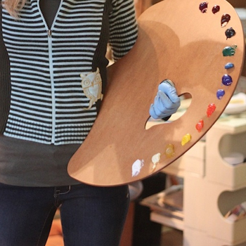
For example:
My Extended Palette
- White:
- Titanium
- Yellow:
- Naples Yellow (cool)
- Cadmium Yellow (warm – medium most closely represent true yellow
- Orange:
- Cadmium Orange (cool)
- Red:
- Cadmium Red (warm – light most closely represents true red)
- Blue:
- Cobalt Blue (cool)
- Ultramarine Blue (warm)
- Brilliant Greens & Blues:
- Viridian (cool)
- Thalo (cool)
- Duller versions of Yellow, Orange, Red:
- Raw Umber (cool)
- Burnt Sienna (warm)
- Brilliant Red:
- Alizarin Crimson (cool)
With these few colors I can duplicate virtually all other ready-made tubes of paint, including black. At times I do use Ivory Black, but never alone because it cracks. I can mix a deeper ‘black’ using Alizarin Crimson & Ultramarine Blue with a dash of Burnt Sienna.
There are a few colors on my palette (Naples yellow, Burnt Sienna, Raw Umber) that I could mix myself, but I use them so much that is easier to squeeze them from a tube. But don’t let yourself get too carried away with taking up palette space with more pre-mixed paints.
The more you paint and experiment, the more you will learn how to customize your own palette with pigments that suit your needs. Just be sure to organize your paints in the same manner each time!
For a visual of my palette be sure to watch this short & informative video:
Check out these articles about color & more:
Use the Hidden Meaning of Color in Your Art & Design
The Importance of Value and Tone in Painting




Lori,
You’ve said the magic words…that’s when it becomes a habit and you don’t have to think about it.
Habits can be good or bad – in this case the established habit makes it easy for you to accomplish your goals. To turn out fine works of art for enjoyment – yours and ours!
@auntiestress
Hi Marianna – Thanks for reading and commenting on the ‘Habit’ post. Glad you liked it and hope it helps you when you need it! Lori 🙂
Thanks for your sharing your palette organising tip Lori, I’m going into my studio now to try lay out the colours just like in your video, and on a piece of glass i found in the bargain corner of our local Ikea furniture store.
Thanks again, happy painting
Kin
Kin, it’s great to hear that these tips are coming in handy for you. You are very welcome and thank YOU for the visit and comment.
Happy painting to you too-
Lori
I would add Yellow Ochre to the list. You just can’t make a decent ochre by mixing, and that was important to me because I used it a lot.
I’ll post my palette to your facebook wall, but it isn’t being used for painting at the moment, so there is no paint on it. But it is very large, and paint was arranged in a circle with a large amount of white and less black in the inside circle. It was easy to clean since I could just use a scraper, and the large size let me use as much wet medium as I wanted.
Hi Karen, it’s great seeing you here as well as on my fan page! I look forward to the palette post. It will be a fun one. Yes, yellow ochre is a great color to add. I often add it to my palette, especially when I am painting outside. But, I can get a pretty good mix of my own, that’s why it wasn’t in the video.
Thanks!
Lori
Hi Lori,
What warm/cool Cobra palette do you recommend? I have a starter set of 10 but I’m unsure which are warm or cool. Just curious what you are using.
thanks!
Jodi
Hello Jodi, besides titanium white, I usually have a Naples yellow, cad yellow light/med, I use madder lake for cool red (they don’t have alizarine)/cad red light, ultra marine blue/cerulean. That covers the yellow, red, blue families. Then for my extended palette I add raw umber/burnt umber, and permanent green. Hope this helps!
thanks for this Lori – I’m going to try it!
Let me know what you think!
Hi Lori:
I’m an amateur painter from Spain. I’d like to ask you what is raw umber good for.
Thank you!
Hello Pedro, my apologies for the belated reply. Raw umber is great for still life painting. Especially for traditional backgrounds. It is a wonderful earth tone.
Hi Lori, thank you so much for clarifying. The explanation of where to place your white (left or right hand side) made a lot of sense to me. One question:
Could you advise the product specifications, brand, and color name that you used to spray paint the back of your glass palette? That’s a beautiful mid-tone gray and would like to get the exact same one.
Thank you so much for the valuable information.
I’m happy my palette tips helped you! It really is helpful to lay the paints out in order. It will help you be more efficient when painting.