We can learn a lot about an artist by looking at the artist’s working palette.
The daubs of paint, stubs of pastel and puddles of color left behind on the palette are an intriguing trace of the working methods and psyche of the artist.
Some painters prefer to organize their palette from light to dark pigments, while others place their paints from cool to warm. Many methodically arrange their paints in the same working order each time they paint.
But, of course, there are those who lay out their colors in a haphazard manner. (If you are perplexed at how to organize your paints on a palette, check out this helpful post, “Palette Tips: Organize Your Paints”
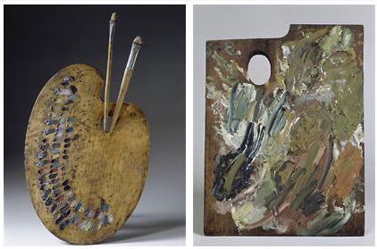 The persevered palettes of legendary artists help with valuable insight into the psychology and techniques of the old masters. Below you can see some famous artists’ palettes. Notice how different they look.
Starting from the left is the palette of Eugene Delacroix. Delacroix approached this process with great care: “My freshly arranged palette, brilliant with contrasting colors, is enough to fire my enthusiasm,” he noted in his Journal on July 21, 1850.
The palette on the right is from Vincent Van Gogh. When we think of Van Gogh, most of us think of warm yellow sunflowers and starry night blues. But, Van Gogh’s paintings were not always colorful. As late as 1885, Van Gogh was still in his Dutch period, painting works like The Potato Eaters, which feature dark, muddled, grays, browns, and greens.
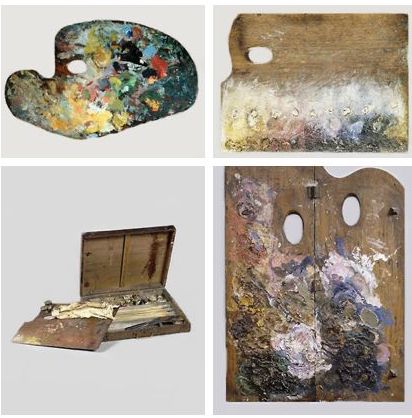 Next, in the upper left is the palette of Claude Monet. When asked in 1905 what colors he used, Monet said: “The point is to know how to use the colors, the choice of which is, when all’s said and done, a matter of habit. Anyway, I use flake white, cadmium yellow, vermilion, deep madder, cobalt blue, emerald green, and that’s all.”
George Seurat was a post-impressionist painter who believed the eyes do the mixing instead of physically mixing colors to create new ones. Seurat is most known for developing and using divisionism in his paintings. His rectangular palette is in the upper right, next to Monet’s.
The lower left is Renoir’s palette and paintbox. Pierre Auguste Renoir was a French artist and a leading painter in the development of the Impressionist style.
Paul Gauguin believed “Pure color! Everything must be sacrificed to it.” Yet, overall, his tones were muted, and quite close together as you can see from his palette on the lower right.
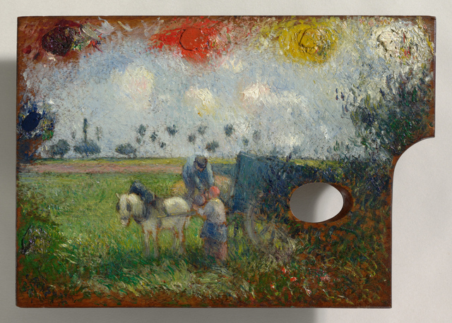
The beautiful palette of Camille Pissarro, The Artist’s Palette with a Landscape, 1878-1880 is a work of art in itself! oil on panel 9 9/16 × 13 11/16
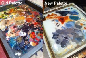
***After reading an interesting article called, Why Preserve Van Gogh’s Palette, I was inspired to engage my Facebook readers on this topic. I asked my readers to show me their palettes! It was fun and interesting to see everyone’s different palettes and working habits. Here are a few samples of their palettes with a little explanation by each artist, enjoy.
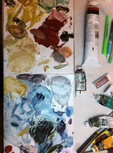
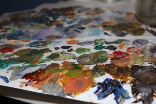
Suzanne Frazier (This is the palette I am using for a commission that I just finished yesterday. It’s a painting of sunlight and clouds. But here is the raw paint, ready to be applied to my concept.)
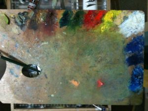
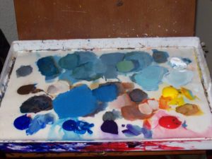
Ria Krishnan Fine Art ( I use a wooden palette that came with the french box easel. This is how I organize my paints each time I paint. I clean it after every painting session and save my left over paints on the left most corner. Left overs constitute valuable grays)
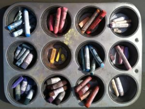
Cathleen Waldrop’s Art Studio (I use an old muffin tin to organize my pastel sticks that I am using. Many times I will group the colors based on where I am using them in the painting rather than by color family.)
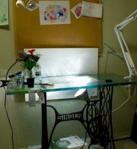
‘Diana O’Hara Van Baale (Here is what’s on my disposable palette! Wish it was more organized. It is what it is!)
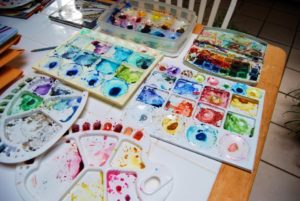
Ardith Goodwin (Here is my working palette for my watercolors. Lots and lots of options!)
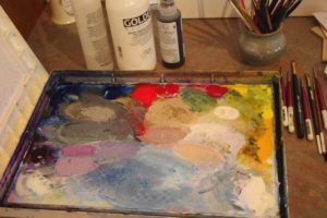
Judy Hemmerling-Schafers (You asked for it! Judy Leila Schafer’s palette….just before a cleaning.)
Hope you enjoyed this post! I love seeing the palettes of painters. The palettes end up being a work of art in themselves!


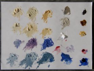
I think I want to introduce Naples. Additionally, I love using Indian Yellow, Phthalo Turquoise, Permanent Rose and Magenta. Aren’t Viva towels wonderful. I am going to use your alcohol idea as well. Thanks for sharing.
Hi Janet,
It is fun seeing you here again. Yes, Naples really is a nice color especially for studio works. I use it a lot in my still life paintings. The alcohol trick is great!
Lori 🙂
My most colourful item is my water jar…dabs of spare acrylics all over it!
I bet it looks cool! Thanks Phil.
Lori
Thanks for the wonderful views of artist’s palettes, Lori. I find it fascinating. For specific colors artist use, Aron B Miller has a great blog dedicated to oil painters palettes at http://oilcolorpalettes.blogspot.com/
Hello Jean,
You are welcome. Thanks for stopping by and commenting. This was a fun post to write. Thank you for sharing the link.
Lori
Palettes are like our hand writing! Thanks for collecting these examples. It is really interesting and fun to look at.
Wow! I can’t believe I missed this post until now. I just posted my photo of Claude Monet’s palette on my website today! Have a look – it is just breathtaking.
http://www.lindarossostudio.com/news-from-the-studio.html
Hello Linda, thanks for sharing your link…I will check it out. This post was interesting to write, and I also enjoyed seeing everyone’s palettes, they really are beautiful. 🙂
Lori
Hello Lori, your site is really amazing! I’am reading a book about social web that point your site!
Gretings from Germany.
Ariel
Thank you for letting me know Ariel! What book? I’d love to know the name of it. I hope to visit Germany someday…
Cheers,
Lori 🙂
For a while I collected and took photos of my “finished” art palettes. See some here: http://www.charleskaufman.com/palettes.html
Charles! What a great idea. Thanks for sharing your palettes with us here.
Happy painting,
Lori
Hi Lori. That is not my palette!
Hi Steve, which one? I looked and wasn’t sure…