 These easy-to-learn color principles can help you improve your art and design. For years, artists, color theorists and interior designers have used the hidden meaning of color to elicit a certain mood. This article is about the color Green.
Color can quickly transform a dreary room into a cheery room. Painters, photographers and other creatives can learn to use these same principles within their artwork to transport their viewers’ imaginations.
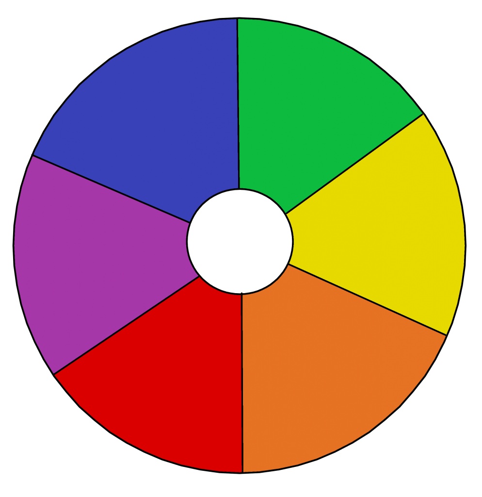
Over the past few weeks we have learned about the primary colors Red, Yellow and Blue. Now we are learning about the secondary colors.
The color Green is a secondary color: A made by mixing the primary colors together.
For example…
When mixed together: Primary color, YELLOW + Primary color, BLUE = Secondary color, GREEN
The color Green has both a warming and cooling effect. This is why green is the color of harmony, balance and security. Green also has a calming effect and symbolizes hope, peace, gentleness and modesty. It is soothing, refined and civilized with great healing power. Greens are particularly restful.
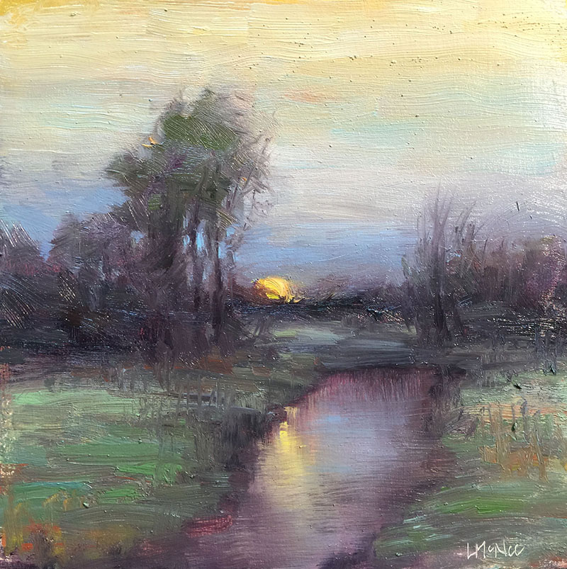
Dark greens remind us of money, banking and Wall Street. Green gemstones are reputed to attract money, and wealth.
However, at times yellow-green is used to portray sickness, discord and jealousy. Remember the phrase, “green with envy”???
But for the most part, green suggests stability and endurance, hope and growth. It sometimes denotes lack of experience, for example a ‘green-horn’ is a novice. Green makes us think of spring. Green contains the powerful energies of nature, growth, desire to expand or increase.
Try using the color green to evoke a sense of balance, to promote a need for change or growth, or protection from fears and anxieties.
Go-Green!
*****
For a lot more about color, be sure and read: Use the Hidden Meaning Color in Your Art and you might like, Go Green Clean: Purify the Air in Your Studio or Office with House Plants
To learn more about ‘green’ please read the book, Color Style: How to Identify the Colors that are Right for Your Home or the article, Color Green Meaning



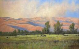
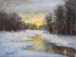
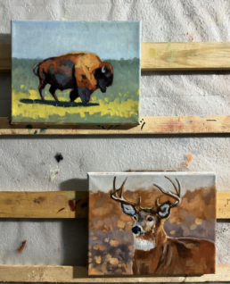
Hi Lori, I love your artwork and finearttips website–its so helpful. I just have a question about painting grass and trees. What colors do you mix to get your greens and what style do you use to paint the grass and tress with. This is always a challenge for me–kind of hit and miss. Thanks.
Keith
Hi Keith. Thanks for your nice and encouraging words – it means a lot to get some good feedback for my efforts! Anyway, green is one of the most subjective colors that artists mix. What I mean by that is, every artist really mixes greens differently. You can see a lot of the artist’s personality by the kind of green he or she mixes…that said, there are so many ways at arriving at nice greens for grass and trees – in fact, this should be a blog post!
However, my basic advice is to mix your own greens. Don’t use green straight from a tube. I do use veridian, but I always add either cad red, burnt sienna, or alizarine crimson to tone it down. Otherwise, it is too acidic and fake. You can try using ‘sap green’ from the tube, but again mix in some earth tones…You can also add cad yellow or yellow ochre to change the green to a lighter shade. Stay away from white and use a bit of yellow instead.
I hope this helps you! Let me know what you think.
Best of luck and thanks again-
Lori