Little did I know that my drawing background would give me a good foundation in value for my painting. Value is how light or dark that color is.
-
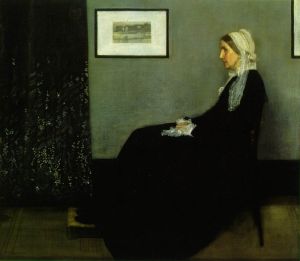
For example: If you took a black and white photograph of your painting, the shades of gray would be the different values within the painting.
(©2006 Lori McNee “Approaching Shadows”)
Simply put, value is the lightness or darkness of a color or hue.
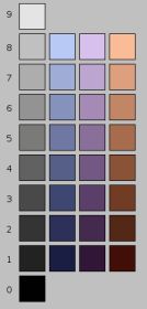
- In painting, value changes can be achieved by adding either black or white to the chosen color. (Below: chart on left)
- However, this also reduces the saturation and adds to the dilution of the color. (Below: chart on right)
- Tints, tones, and shades are variations of the hues found on the basic color wheel when white, black or both are mixed in.
Believe it or not, value is more important than color to the design and success of a painting.
- Value is used to create a focal point within a painting or drawing.
- The human eye is immediately drawn to a light element against a dark element. This creates, the focal point of interest.
- To create the illusion of depth, gradations of value are also used.
- Areas of light and dark give a three-dimensional illusion of form to subject matter.
| white | ||
| 2 | high light | |
| 3 | light | |
| 4 | low light | |
| 5 | midvalue | |
| 6 | high dark | |
| 7 | dark | |
| 8 | low dark | |
| 9 | black |
The above value scale of Denman Ross was introduced in 1907. His value terms set the standard still used today. This scale helps artists understand and identify light, mid-tones and darks more easily.
Value is independent of its hue. This is a fundamental element in the impact of visual art whether abstract or representational.
You might also enjoy:
A Unique Approach Using Color Harmony to Improve Paintings
Use the Hidden Meaning of Color to Improve Paintings
How to Bring Out the Mona Lisa in Your Own Artwork
For further reading on the internet: Tone Value and Painting Color Tone











Thank you for so generously sharing your knowledge. Your explanations are so understandable for novices like myself. It makes me want to keep reading more — its a great way to motivate people to learm more.
Thanks again!
Hi Lori – thanks so much for sharing your blog. Very important information. I have forwarded your blog address to my students to read your post on the importance of value.
Hello Donna, glad you are enjoying my blog. I am grateful for you sharing and the comment.
Lori… you did an “excellent job,” explaining this, especially adding the B&W value chart next to the color chart. So many people have a hard time understanding the black-and-white values related to the color values.
Bravo!
Hello Lee, thanks for stopping by. It’s fun to see you here. I am glad you enjoyed this post!