As artists, photographers, designers, and crafters, we can learn how to use the positive or negative attributes of color in our works to subliminally send a message. The color RED can be used to evoke a certain mood, to create a message or sharp response in the viewer.

Most professional artists know how to use color to their advantage, but many aspiring and novice artists are not aware of the power of color. Here are some interesting facts about the color RED.
RED is a primary color…
RED is a warm color…
Warm colors:
- That are based on yellow undertones and tend to convey emotions ranging from happiness to violence.
- Red, orange and yellow colors trigger hunger.
- This is why you see restaurants like McDonalds, Wendy’s and Burger King using these colors in their logos and advertising.
- Safeway, Walgreens and Costco all use red in their logos.
- Red instantly attracts, makes people excited and increases the heart rate.
- Just think of Coke and Red Bull!
RED: The color of assertion, strength, romance, excitement, vitality, physical power, outgoing, ambitious and impulsive. It is a color that flatters the skin and can make an excellent background. Pale pink are warm and peaceful and combine well with greens. The deeper reds create an atmosphere of retrained opulence and power. Red elicits an uncomplicated nature with a zest for life. But, red can also connote danger or threats. Fire engines, stop signs and traffic lights are a perfect example.
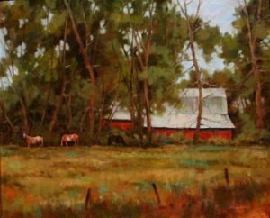
Did you know the American ‘Red Barn’ actually came into being through function and utility, rather than decor or superstition. It was soon discovered that the red barn color was warmer in winter since it absorbed the sun’s rays!
“Lazy Days of Summer”by Lori McNee © 2008
An interesting fact: The pigment called “Indian Red” was originally made from clay mixed with whites of wild turkey eggs. Turkey blood was added to provide a deep mahogany shade. Stains using blood were not, however, suitable for outdoor use. Records indicate that this was in accordance with an old American Indian custom, farm stock blood was indeed mixed with milk and used for staining interior surfaces.
Now with a better understanding of ‘red’, I hope you can use it in your art or design to send the right message to your viewer. Please be sure and check out the complete article& my sources , “Use the Hidden Meaning of Color in Your Art”. You may also enjoy reading: “The Importance of Using Value & Tone in Painting” and “Painting with Complimentary Colors Using Yin Yang.”
Click here to read more about, Why Are Barns Red?
 PS. I wore red in this picture because I wanted to stand out! ~Lori 🙂
I really enjoyed reading the book: Color Style: How to Identify the Colors that are Right for Your Home





Lori,
Thanks for this series – not only is the subject matter interesting, your great writing style presents it so well!
I’m wondering if you plan to talk about the Color Institute, the “color of the year” and trends in painting that reflect interior decor colors. This is certainly a topic that may be important to many artists.
Genial fill someone in on and this post helped me alot in my college assignement. Say thank you you on your information.
I am not sure I am in the right place for this response to your article about not using black. But here go’s anyway. Yes I have always been taught to never use black because true black doesn’t exist in nature. However later on while taking lessons from a private art instructor, he taught me to use paynes gray in place of black. I have found out over the years that I prefer this over using ultramarine blue and burnt umber because I tend to get a quicker and better way for me to achieve highlights which tend to be of a cooler tone against really dark subjects. I don’t know if it is right or wrong but it works for me. Also I use a paynes gray wash to create shadow.
Hello Paul,
Black can deaden color, or if used right it can make lovely grays and greens. But, it takes some practice. You can also mix your own blacks like you stated, viridian green and alizarin crimson makes a great black too. Yes, paynes gray works if used correctly too. Shadows are not always the same color from a tube, like paynes gray. Shadows take on the ‘local color’ of the surrounding environment. Just like with anything in art, it just takes practice to find your own way. Here’s a recent post about color mixing. https://www.finearttips.com/2013/07/color-mixing-dont-always-stick-to-the-rules/ I hope it helps!
I like the way you express your art. You are my art idol.
Ah, Peyton. That is very kind of you. Thank you for letting me know and for visiting here.