Luminism refers to an earlier generation of landscape painters from the late nineteenth century who painted scenes along the Hudson River and the eastern shores.
Of all the ‘isms’ I believe that Tonalism and Luminism are most closely related. It isn’t very clear, but there are some recognizable differences between the two. First of all, the Luminist painters preceded the tonalist movement. But, both popular American art movements were inspired by the interaction between sky, water, and landscape.
- Luminists used cool, clear colors
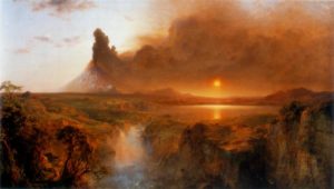
- Luminism represented specific places realistically
- Detailed objects modeled by light
- Unnoticeable brushstrokes
- Melodramatic, grandiose oversized landscapes
- The artist wanted to capture the immenseness as they viewed their subject on location.
- Emphasis on Nature’s grand scale
- The American counterpart to Impressionists.
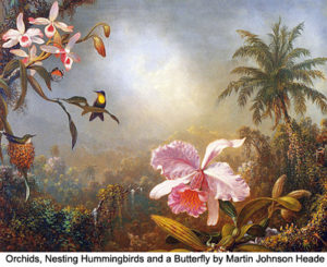
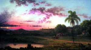
The American Luminists were a group of well-known painters including Martin Johnson Heade (1819-1904), and Frederic E. Church (1826-1900). Both are favorites of mine. Their goal was not merely to illustrate nature’s radiance, but also to interpret the landscape with a spiritual meaning. William Keith’s words could apply to this earlier generation: “What a landscape painter wants to render is not the natural landscape, but the state of feeling which the landscape produces in himself.”
Britannica Concise Encyclopedia: Luminism is characteristic of the works of a group of U.S. painters of the late 19th century, influenced by the Hudson River School. Typically landscapes or seascapes, with sky occupying nearly half the composition, luminist works are distinguished by cool, clear colors and meticulously detailed objects modeled by light. The most prominent luminist painters were John Frederick Kensett, Martin Johnson Heade, and Fitz Hugh Lane.
Don’t miss this fabulous article, “Light it Up” which delves into Luminism, by Christopher Volpe.
For related reading please check out:
The Importance of Value & Tone in Painting
How to Bring Out the Mona Lisa in Your Artwork



Lori: Most of what you say, art-wise, I more than agree with—I applaud—but PLEASE stop propagating the persistent but nonsensical yet-refuses-to-go-away confusion between additive and subtractive color mixing, something you as a practicing artist MUST be aware of! It is not the Yellow-Red-Blue (YRB) but the Yellow-Magenta-Cyan (YMC) “primaries” that you mix pigment paints with, the former relevant for color harmony and the way our eyes perceive color contrasts but NOT the way paints are mixed (subtractively for the most part, with aspects of scattering). Don’t add to the centuries-old color misinformation already out there—you’re too good for that. (I’m an art teacher / color tutor and artist myself and understand the difficulties inherent in color light vs color paint mixing and how the latter is NEVER an easy formulaic teaching, not with metamerism, substrate uncertainty, color as a PERCEPTIONAL phenomenon vs “local color reality,” etc.)
Thanks for your input about color mixing Elric. I agree with you, and would welcome any guest post you would like to share on the subject of additive and subtractive color mixing. To your point, I have observed that fine artists and many art educators still use the Y-R-B primaries. There is a major difference between mixing of paint/dye colorants and the mixing of lights. I do find ‘color theory’ a complex subject to tackle, and hope you will consider my offer to guest post! You can share any of your own personal links too > https://www.finearttips.com/contact-me/submit-your-guest-article/
Lori: Elric and I went to Syracuse University in 1975-76. I lost touch with him. Do you have his email address? If so are you willing to share it with me.
I am not sure who Elric is???
Lori,
That was 1880’s. Sorry.
Brenda