To help you with your creativity, I have rounded up 14 of my favorite drawing tips and techniques to kick-start your artwork and help you to achieve stunning results.
Pens and pencils at the ready…
Draw upside down
Nope, I haven’t lost my mind – drawing upside down helps you to ‘unlearn’ the bad habit most of us have of drawing what we think we see, not what we actually see.
For example, when drawing a portrait, children will often draw long hair as two strips either side of the face. Unless you have an unusually dodgy haircut, they are drawing what they know about hair rather than looking at the way it really is, i.e. it falls behind the neck, partially covers the face and shoulders, and so on.
The next time you are drawing from a photo, try inverting it. The new perspective it gives will help you to be more accurate. (read: Struggling with a Painting? Turn it Upside Down!)
Mirror, mirror
Similar to drawing upside down, frequently checking your drawing in a mirror will refresh your perspective and help you to see where you are going wrong. For example, when I check my portraits in the mirror I am looking for an approximate symmetry in the face; an oversized nostril is much easier to spot when you see it in reverse. If you need proof that it works, Leonardo da Vinci used this technique himself!
Experiment with different media
For a long time I drew in pen only, convinced that this was my style and the only way I could draw. A series of bad experiences with (blunt) pencils at university put me off all things graphite. However, when I finally challenged myself to pick up those pencils, they added a soft and blended effect that I could never achieve with pen. I’m a convert! (read: 10 Ways to Expand Your Artistic Repertoire)
Now, if I want a striking image I go for pen, and for anything more delicate I go for pencil. Which brings me nicely onto my next point…
Sharpen your pencils
Do your work justice and keep those pencils razor sharp!
Mould it
If you struggle with light and shade, get some modeling clay and mould it into the shape of your subject. It doesn’t have to be perfect – the idea to help you understand its shape looks from all angles and how the light source bounces off its surfaces to create shadows and highlights.
Light relief
Drawings are flat, but they needn’t look it. Turn your drawing into a map using contour lines – lines that indicate gradient. For example, if you were drawing a face, the ‘highest’ point would be the tip of the nose, so start here with a small nose-tip shape, then move out using expanding shapes. Lines close together indicate a steep gradient (e.g. the nose), while lines far apart indicate a gentle gradient (e.g. the cheeks).
When you are finished you will be left with something that resembles a ‘paint by numbers’ sheet. If you like, fill these areas in with the appropriate colors and shades, and you will end up with a very 3D-looking image.
Grid method
Keeping proportion is one of the biggest challenges when copying from an image. To eliminate the guesswork, measure out a square grid over the image you are copying and another on your paper.
Use light pencil so you can rub them out later. If the image you are copying is the same size as your paper, both grids should be identical; if it is bigger or smaller, you will have to scale your grid up or down to keep the same ratio: for example, if I am copying an A5 image to A4 paper, I would draw a 1cm grid on the A5 image and scale it up to 2cm on my paper, ensuring my drawing is exactly twice the size.
Once you have your grids, scrutinize the source image square by square, copying each one to the corresponding square on your own grid. This is a very methodical way of drawing and pretty time-consuming, but worth it to achieve a near-identical copy. It works by breaking the overall drawing up into manageable chunks – you may not be able to copy an entire image in one fell swoop, but I bet you can copy a 1x1cm square almost perfectly – then just repeat!
Use shapes
If you were asked to draw an elephant, where would you start? With the trunk? The ears? It is common to want to hone in on the details straight away, and while there is nothing wrong with this, by starting small you risk running out of space later on. For this reason it can be helpful to block out the drawing first using big, rough shapes. The elephant has powerful shoulder muscles, a huge head and thick legs, so these are what I would quickly block out first, before refining the shapes further and then moving on to the details.
Draw on the go
Being a perfectionist has its obvious advantages – you won’t show anything to your friends that you wouldn’t be happy to hang in the Tate gallery – but sometimes it can cause you to obsess over the minute details of your drawing rather than allowing yourself to make (helpful) mistakes.
Challenge yourself to draw quickly and – yes – imperfectly, by taking yourself to off to the zoo, the park or even the bus and drawing on the go. Human and animal subjects will never stay still for long enough for you to worry about perfection, giving you just enough time to sketch a quick study of your subject before the scene changes.
Disclaimer – if you are drawing humans, make sure they are happy for you to do so (sleeping commuters are fair game). The object here is quantity, not quality, which may not come naturally to you, but will give you tons of useful reference material to take home and develop.
Draw negative space
Another way to gain a new perspective on your subject is by not drawing the thing itself, but the negative space around it. This works particularly well when using thick, heavy media such as charcoal. You know those optical illusions that look like a candle stick or two faces, depending on how you look at it? This shows how negative space can provide an interesting drawing in itself.
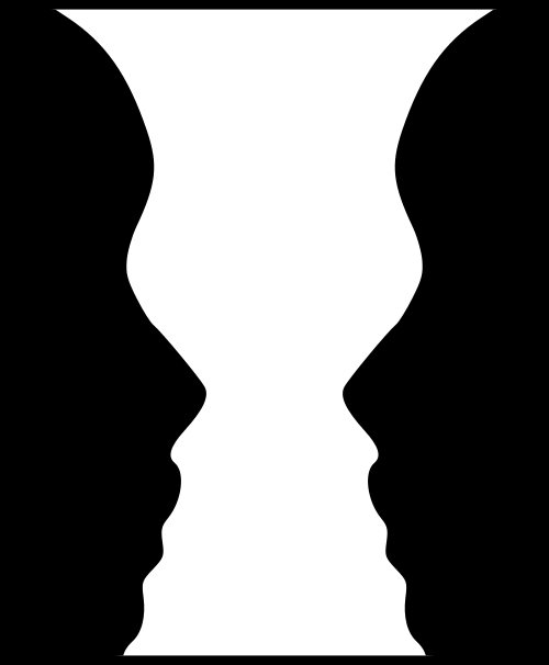
Mouse hole drawing
If you’re stuck in a rut and lacking inspiration, try and view the world through a mouse’s eyes – how different would your shoes look when viewed at ground-height, bringing the colors, textures and even the tiny scuff marks into sharp focus. How intimidating a pair of Jimmy Choos would look towering over you! Or how about a bird’s eye view – different again. The possibilities are endless; stop drawing things as you and step into the mind-set of someone or something else. Bet your still life drawings are ten times more interesting!
New dimensions
Drawing big and drawing small are very different disciplines. Try drawing to the dimensions of a postage stamp, then do the same drawing on the largest sheet you can find. Do you notice the different techniques and observations that come into play at each size? You may find one much easier than the other and discover a new niche for your artwork.
Go digital
Whether you just want to touch up a drawing or to create the whole thing digitally, technology can be a great addition to your artistic repertoire. Adobe Creative Suite is the industry standard design software and it is well worth downloading a free trial of Photoshop (for editing) and Illustrator (for creating). Gimp is a free alternative to Photoshop, or for more basic filters, try Picasa. Just take your drawing, scan it onto a PC or Mac and experiment. The things you can do with Creative Suite are pretty mind-blowing so rather than read me list them here, search online for free tutorials to help you get started.
Start a portfolio
Finally, if you only try one thing as an artist in 2014, start a portfolio. Stop discarding your sketches and half-finished projects and start filing them properly. You owe it to yourself to keep a well-presented record of your work with the triple benefits of feeling more organized, protecting your drawings from coffee rings and dog-ears, and being able to flick through and see your progress over the weeks, months or even years. (read: How to Create a Powerful Portfolio)
Hope these tips provide you with some inspiration for the New Year – good luck and happy drawing!

Guest Author/Artist: Vikki is a freelance illustrator specializing in portraits and animal drawings http://www.drawnbyvik.com . She has studied drawing at university level and currently sells handmade eco-friendly greetings cards from her online shop while working alongside artist Stuart Morris.


wonderful suggestions Lori! I rarely draw right side up, my drawings are always sideways and up side down, as i look for shapes and negative spaces…not noses, eyes, ears, etc. i also draw almost every single day if possible…for hours!!
Great tips, I try to do all of them regularly 🙂 but I keep forgetting about negative space, even though I promised time and time again I would use it.
Regarding the “mirror”, since it’s kinda tricky to move my large paintings (or large mirrors) around, I started using my smartphone and the free picture editing app to photograph the painting and mirror it. It also helps me to see the work from the distance, because so many times I noticed some funky things with contrast only when I was making thumbnails for my website and then it became glaringly obvious.
Of course standing back from your art works just as well.. but how often do we forget that?
Hello Nela,
I love using the negative space technique. It has helped me through the years along with using a mirror to look at my work backwards. I have used a hand-mirror with large paintings, and that works well. Your smartphone idea sounds great!
Thanks for sharing your tips! Might be worth its own blog post…I always welcome well written guest posts, hint, hint. 😉
Awesome tips! While most of the suggestions can be found in Betty Edwards’ “Drawing on the Right Side of the Brain,” it is nonetheless refreshing to see exercises from 20 years ago still remain relevant up to this very day, even longer! Also, if you don’t mind, we used this post as a resource to our blog post about improving clarity in artworks. Here’s the link: http://portprep.com/wp/2014/07/improve-clarity-artworks-10-resources/
Hello Chris, yes Betty was a pioneer and most of these exercises are from her. It is helpful to see them again. Thanks for sharing the link with me.
Thanks for sharing valuable fine art tips, these tips will give new approach to the artistic skills of a beginner and creative expression of their art will get a new character.
You are welcome, and thanks for stopping by and sharing your thoughts.
I love you blog cause it can help me with my drawing skill. It can help me through my art class.
Hello Atarskui. I’m so happy to hear that this blog is helping you with your drawing skills! Thank you for letting me know and good luck with your continued growth at drawing. ~Lori
Using a grid will not only not help you improve your drawings skills (at all), it will likely even set you back and be nothing more than a clutch in the end.
Drawing skill, in the end, is defined by the skill without need of assisting tools such as grids, or even rulers,…
Perhaps my view is a bit harsh seeing as I stumbled upon this article expecting techniques for artists who have hit a plateau that is a bit higher than having to rely on tricks. There are no tricks, sadly, the only trick is to be persistent in your drive to be the best you can, by drawing at every given occasion.
Also, to the person who rarely draws upright, I would seriously consider revising your approach as a whole. As there is nothing wrong with the technique (I even recommend it a lot more than using a grid), but there is when one only relies on this method. Unless you go through life with a periscope, you WILL have to learn to deal with the fact that… faces will look like faces and hands will look like hands, but the trick is to recognise even in those things we know and symbolise in our heads, the basic shapes you see when drawing upside down.
In the end, the only way to improve drawing skill is by drawing, however, thankfully there are a thousands ways to approach this and, probably, a little bit of each of them is needed to truly become a master at drawing, if such a thing even exists!
Obviously that should have been crutch! Haha..
I also forgot to mention (shame on me) that I do think your article was well written and you do provide valuable information and tips, so well done! Other than the fact I do not agree with the grid method for learning purposes (it is a good tool to translate your already trained technique to larger surfaces though, for example), I think you offered some good advice!
Thanks for your additional thoughts. The grid method seems to be a heated topic!
Hello, I am way behind on comments. Thanks for your patience.
Your thoughts on the grid method are interesting, and there is a lot of validity to what you are saying. However, even the Masters used the grid method as a helpful tool for getting correct proportions and likenesses. I used it way back in college, but prefer free drawing myself.
Thanks for adding your insightful thoughts into this comment thread! Happy drawing, Lori
Aww that’s ok dear. If you’re going to censor out every little bit of criticism, that really says more about you than anything else. Keep recommending people that are learning to draw to use the grid method, it’s a horrible way to learn and will hold students back, but whatever, I’m sure you know think you know better. (not really, or you would have simply addressed my remark instead of censoring the post altogether)
Good luck with the rest of your career, although I hope in real life you are a little less bigoted and full of yourself, but of course, that is only the impression you leave from how you handle online conversations, by muting them when you don’t like what’s being said :^)
Bye!
Thank for your patience in waiting for my reply. I am way behind on comments.
As you know, the grid method is age old tool that was used by the Masters. I myself haven’t used it since college, as I prefer freehand drawing. But, the grid does come in handy at times. I don’t believe this guest author suggested using the grid method to the exclusion of basic rendering.
Thank you for adding to this conversation.
Aww someone’s in a bad mood
I just read Miss Lori’s tips today
But they arent show offy or so full of pride
Its just that the way you perceive someone else that u wrote such a comment
Learn to be a bit more appreciating
You might need another website for tht <_<
Hello Merioki, thank you for adding to this comment thread. I truly appreciate your kind outlook. I hope you enjoy this blog! Cheers 🙂
Quit the truth, Miss Mcnee! The tips were quite useful, and I’m gratified!
As I’m only 13, these tis are quite a step to my future career.
Unfortunately, not everyone appreciates free of cost help in this cruelly corrupt world.
Anyways!
Thank you Nee-chan! (Japanese word for people elder than you) 🙂
I love and admire your painting’s soo much. Your prescriptions are really helpful !! I have an art exam tomorrow and your tips have really helped me!! I am in your greatest depth …. I want to be an artist myself and hopefully with your tips I can succeed in that. I wanted to ask you that how do you improves drawing, sketching and painting in strokes??? I am dearly waiting for you’re reply !!! Love Zahra :*
Hello Zahra, your comment is quite touching. I wish you much success in your drawing class and hope your exam went well. This blog has some great advice on drawing and painting. Be sure and read the comments for more tips too. 🙂
Hi Lori,
I love all of these tips! I think the artists who call these exercises “crutches” must not remember being a total beginner–or they never were beginners because they were talented artists as children.
I’m not a talented artist and never have been. In elementary school, I would take hours to draw a simple bunny rabbit. Then classmates would make fun of how terrible it looked while showing off their perfect portraits of the entire Flintstones family.
This year, I finally signed up for a drawing class at my local community college. Since I haven’t drawn anything in decades, I’m still at the level of a sixth grader. The way my brain interprets what I see, the way I hold and move a drawing utensil, the way I perceive shape and value and color–I have to learn them all from square one.
People like me can’t pick up a pencil and sketch something accurately. Telling us to “just draw a lot” is like throwing scores of piano concertos at someone with no musical experience and saying, “just play a lot.” Obviously, the more you draw, the better you’ll become at drawing. Duh. But we need somewhere to start. That’s when these tricks come in handy.
And even if you’re a brilliant artist, what harm could come out of going back to the basics sometimes? Even world-famous musicians use metronomes and tuners. I admire the masters like Da Vinci who weren’t too proud to double-check themselves with mirrors and grids, instead of believing they were geniuses who painted everything perfectly without assistance.
Anyway, I originally decided to comment to ask: who drew that awesome zebra? I’d like to share the image with my drawing teacher to use in her slides, but she’ll want a citation.
-Tamara
Hi Tamara, great thoughts you’ve shared with us on drawing. Drawing is a fundamental that should be practiced. I myself need to do more of it! We must learn to crawl before we walk, and draw before we paint or sculpt! The zebra drawing was from a creative commons site and I don’t know the artist 🙁
my question is how to shade the picture perfectly?
Here are some tips to help https://www.finearttips.com/?s=drawing
THANKS, I REALLY LEARNT ALOT FROM THIS FEW WAYS OF IMPROVING MY DRAWING SKILLS ACTUALLY I LOVE DRAWING ALOT AND THOUGH ITS NOT THAT EASY FOR ME BECAUSE WHEN I TELL PEOPLE THAT I DRAW, IT LOOKS FUNNY AND THEY START ASKING ME IF I KNOW WHAT AM SAYING. JUST BECAUSE AM A GIRL DOES NOT MEAN THAT I CAN’T DO ANYTHING. ANY WAY THANKS ALOT AND AM LOOKING FORWARD TO LEARNING MORE WAYS IN IMPROVING IN MY DRAWING SKILLS, I LOVE YOU, BYE…….
I’m happy to hear my tips are helping you. Yes, ‘girls’ can do anything if we put our minds to it. Keep drawing!
Dear Lori McNee, I draw greeting cards,(winter solstice), for my family. I am having an unusually difficult time drawing lizards. Would you be so kind as to give advise on how I could approach this drawing, ( I use color pencil ).
Thank you,Thomas
Hello Thomas, I hope you will find some helpful ideas on my blog. I do not have time to teach individually via comments. Please refer to the colored pencil posts…https://www.finearttips.com/2010/02/using-colored-pencil-to-create-fine-art/
Hello Miss Lori!
Thank you, Thank you for the art tips!
I’m happy to see that the mirror method is not just a stupid creation of my mind XD
I’m still 13, and draw anAnime art
AGAIN, thank youu!
Hi again Merioki! It is great to have a young artist visit here. I am honored and hope to encourage your creativity. Thank you for your comments. I’m glad you like the mirror tip. ~Lori 🙂
Love drewing