 I was feeling uninspired in the studio, a familiar crossroads many artists face between seasons. I had just wrapped up a series of winter still lifes and knew it was time to shift into landscapes for my summer shows.
While I normally enjoy transitioning between these subjects, nothing seemed to spark my interest. Rather than force the process, I decided to reconnect with one of the most powerful tools in an artist’s toolbox: color harmony.
Specifically, I turned to an ancient concept that has shaped art, philosophy, and nature itself—the yin and yang of complementary colors.
- I decided to have some fun and experiment with color harmony or complementary colors.
- Pairs of colors that share no common elements are called ‘complementary colors’.
- Instead of my traditional palette, I chose to experiment with a revolutionary idea of painting using the 5000-year-old yin/yang approach.
- The ancient Chinese understood our world in terms of a balance of opposites. Everything in nature has its opposite.
For example:
- moon/sun
- black/white
- day/night
- sunrise/sunset
Complementary colors are pairs of hues that sit opposite each other on the color wheel—such as blue and orange, red and green, or yellow and purple. These colors share no common pigment, yet when seen together, they create a dynamic tension and visual vibration. When mixed, they produce harmonious grays; when placed side by side, they sing.
Every color has its opposite, too! Each ‘primary’ color or hue (red, yellow, blue) is directly opposite a ‘secondary’ color (green, purple, orange).
These complementary colors are always found opposite each other on the color wheel:
-
Red – Green
-
Yellow – Purple
-
Blue – Orange
A Masterful Example of the Blue–Orange Yin/Yang
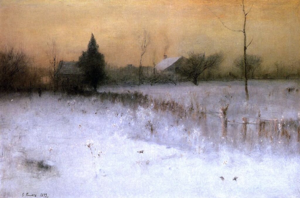
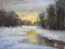
The painting above is a beautiful demonstration of this principle. Notice how the warm orange glow of the sky gently opposes the cool blue-violet tones in the snow. The scene feels peaceful yet alive. It’s a quiet vibration created not through bold color, but through temperature contrast.
- Orange (yang) brings warmth, energy, and light.
- Blue (yin) offers calm, shadow, and rest.
- Together, they create atmospheric unity and emotional resonance—a perfect harmony of opposites.
My Blue & Orange Yin/Yang Palette
Orange Family:
- Cadmium Red Light (warm orange)
- Cadmium Orange (true orange)
- Cadmium Yellow Medium (cool orange)
- Burnt Sienna (earth orange)
Blue Family:
- Ultramarine Blue (warm blue)
- Cobalt Blue (true blue)
- Phthalo Blue (cool blue)
- Plus: ivory black and titanium white to control value and chroma.
This limited palette allowed me to mix a surprisingly broad range of harmonious colors—from lush greens and muted violets to warm browns and silvery grays—all while maintaining unity across the canvas.
When opposite colors are mixed, they create beautiful, chromatic neutral grays. Using this technique, I limited my palette to the family of complementary colors I felt were best suited for the subject being painted.
Out of the three yin/yang palette possibilities, I chose the blue and orange palette.
For the ‘orange’ pigments I used:
- cadmium red light – warm orange
- cadmium orange – true orange
- cadmium yellow medium – cool orange
- burnt sienna – softer orange
For the ‘blue’ pigments I used:
- ultramarine blue – warm blue
- cobalt blue – true blue
- phthalo blue – cool blue
- and ivory black & titanium white
The Beauty of Working in Complements
Complementary colors are not about contrast alone; they are about balance. Just as yin and yang describe the natural interdependence of opposites, complementary palettes offer artists a way to tap into timeless harmony in our paintings.
I was so pleased with the results that I plan to paint an entire series using the yin/yang palettes! For more information, I suggest reading The Yin/Yang of Painting.
Happy Painting!



Lori,
Many thanks for your insightful articles and art tips. As an avid painter, I’m always look for new tips and tricks and you’ve been a big help to me.
Regards,
John Lawson
Thanks John. It is always a very nice compliment to receive good feedback from avid painters such as yourself.
Happy painting!
Lori
I love this blog, more grease to your elbow Lori!
Thanks Dammy! I will keep working hard. I appreciate the feedback.
Lori
awesome brush work
I was browsing the net for color harmony in oil paintings, when i came cross your post! great article i found it very helpful, i am going to try this in my next painting.
Great Tadj, I am glad this post inspired you. Thanks for taking time to let me know. I’d love the hear how your painting turns out.
Best,
Lori
Lori, this is a great article. I have used a similar technique when priming a canvas before starting to paint. I will paint the entire canvas in a complementary mid tone colour. For example when doing a seascape of mostly blue I will underpaint with burnt sienna. The ‘shadow’ of burnt sienna under the blue gives an extra vibrancy, especially if little parts of it show through. I also like how you posted your reference photo next to the finished painting and would love to see more of those comparisions
Thanks for enjoying this post. I love using the compliment for the underpainting too. I will plan to do more photo/landscape painting comparisons in the future. Thanks for your feedback 🙂
The color wheel shown here shows yellow opposite violet, whereas some other color wheels show yellow opposite a kind of ultramarine blue. Why ?
Hello Paulo, many apologies for the belated reply. I am not sure of this answer except to guess those charts are considering Ultramarine Blue a violet? It is a warm blue. That is my best guess…
This was a good lesson for any landscape painter – I found it simple and useful and like the recipes!
Oh good Chris! I’m glad you enjoyed trying this new way of creating a palette. Thanks for the visit.