One of the most significant benefits of painting with a limited palette is achieving color harmony. It forces artists to think more creatively and experiment with color mixing.
Since my art blogging journey began in 2009, I have met and networked with many dedicated artists. One such artist is my friend, Ria Krishnan.
This article shares Ria’s valuable discoveries of painting with a limited palette.
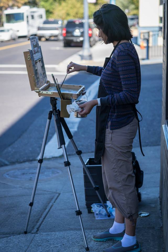
In 2016, Ria sat in her art studio and decided to analyze and self-critique her finished oil paintings, which were stacked up against the walls.
Ria asked herself two questions:
1. Did she like this painting?
2. Why? What is working and what isn’t?
Ria took notes along the way. From this self-critiquing process, she made an interesting discovery. The paintings she wasn’t happy with had something in common — they all lacked color harmony.
In fact, these paintings were more colorful than harmonious.
The paintings Ria wasn’t happy with all had one thing in common – they lacked color harmony!
This “aha” moment became a turning point for Ria. Striving to create more harmonious paintings, she decided to simplify her palette. Ria began using only the primaries (Red, Yellow, Blue) and White.
Initially, it was challenging for her to keep the colors clean. She was accustomed to using “convenience colors” such as Yellow Ochre, Viridian, Raw Umber, and Sap Green.
However, she now had to learn how to mix these colors herself. With practice, Ria became proficient at mixing beautiful greens and ochres.
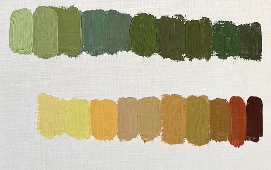
Ria’s limited palette consists of:
- Ultramarine Blue
- Cadmium Red Light
- Cadmium Lemon
- Titanium White
Additionally, Ria pre-mixes the following:
- Darkest dark (a mix of all primaries, leaning towards a reddish dark)
- Green (Ultramarine Blue, Cadmium Lemon, and Cadmium Red Light)
- Orange (Cadmium Lemon and Cadmium Red Light)
 Here are a few tips from Ria:
- Clean your brushes in between mixtures, especially when you’re new to the limited palette.
- Before starting a painting, prepare a good pile of Green, Orange, and the Darkest dark. You have the freedom to decide how these mixes should look.
- Ria prefers her Green to be a darker value with a hint of Red. Her darkest dark also contains more Red, while Orange is pure (Cad Red Light + Cad Lemon), with more Yellow than Red.
- Think in terms of warm and cool. Yellow, Orange, and Red are warm colors, while Blue is the coolest.
- When mixing a particular color, try to determine if it leans towards being bluish, reddish, or yellowish.
- Remember that adding white makes the color cooler. To keep the color warm, make sure to incorporate Yellow/Orange/Red.
Ria explains that her greatest discoveries from painting with a limited palette include a better understanding of value, color mixing, and color temperature.
Working with only three colors eliminates the struggle of achieving color harmony. 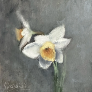
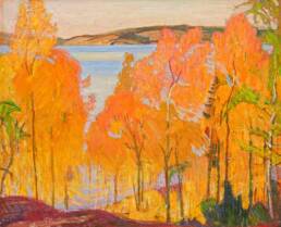
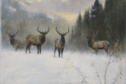
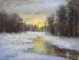
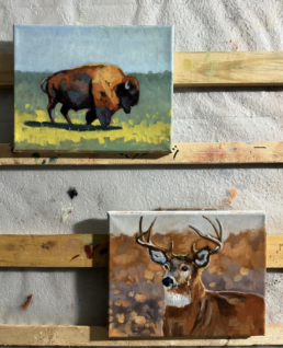
Overall, painting with a limited palette can help artists achieve color harmony, develop technical skills, and save money on materials.
It’s a worthwhile approach for artists of all levels and can lead to more cohesive paintings.
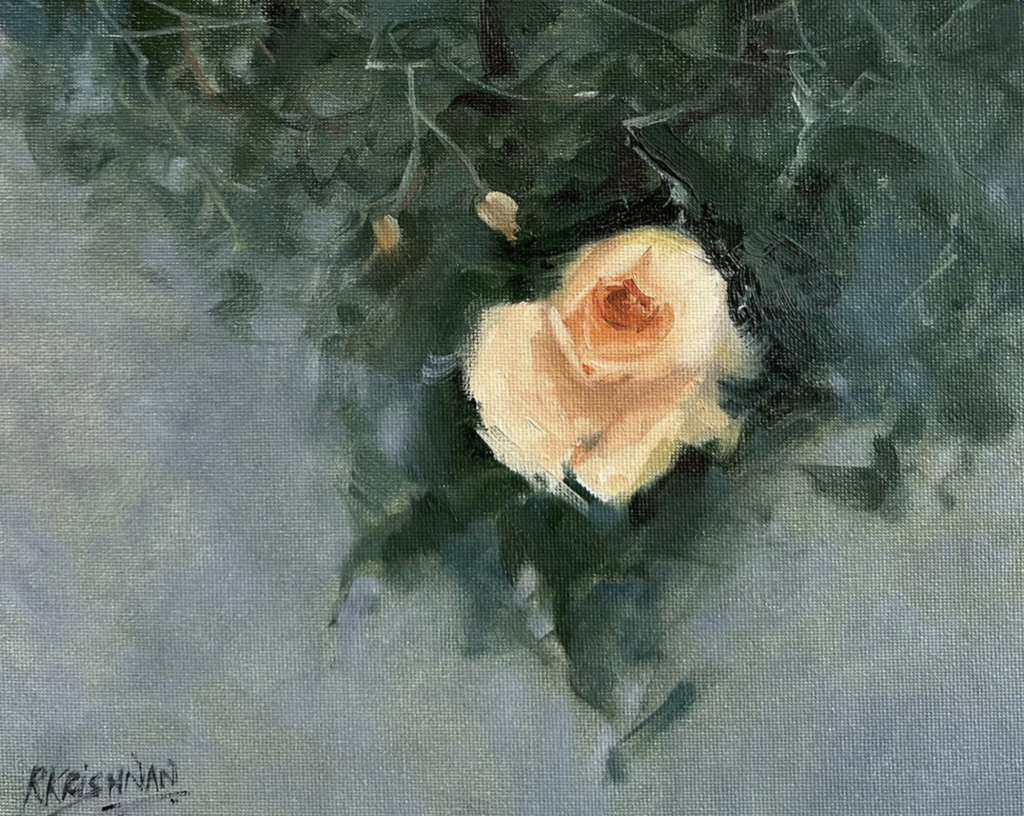
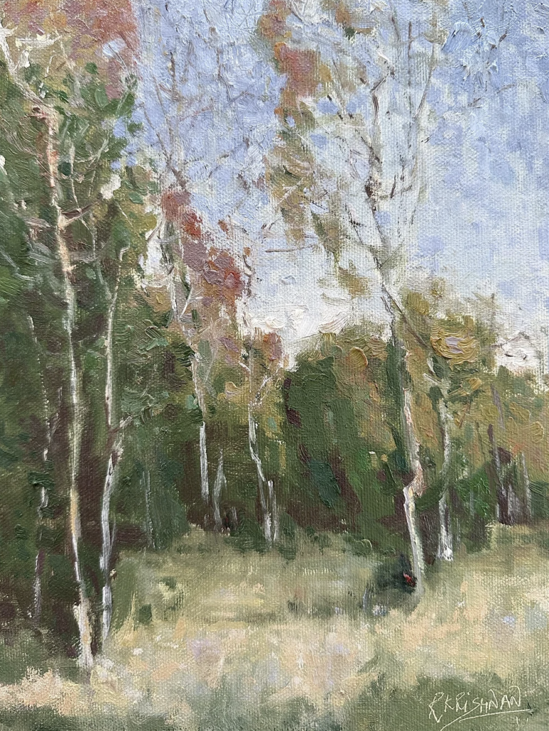
*Visit www.riakrishnan.com to see more of Ria’s paintings or find her on Instagram – @riakrishnanfineart
![]()