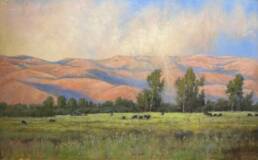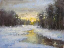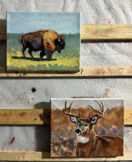


Reflecting on my recent painting workshop in Scotland, I heard a recurring comment from a few students that surprised me. They understood the idea of “value” but, when they looked outside, they were confused about how to actually see value in the landscape.

The fact is, value sounds simple. Like notes on a scale, value is how light or dark something is. But when we are out plein air painting, surrounded by beautiful color, distant hills, trees, water, and atmosphere, it can be surprisingly challenging to separate value from color.
The trick is to keep it simple. Design a painting with 3-4 values. (more on that below)
Also, stop naming the objects for a moment. Instead of thinking, “yellow tree,” “blue mountain,” or “green grass,” ask yourself: Is this shape lighter or darker than the shape next to it?
That simple shift can completely change the way you see. Value is always relative. So, learn how to compare rather than guess. For instance, a tree may appear dark against the sky, but much lighter when compared against a dark shadow.
So, instead of confusing yourself. Ask, “What value is this?” Is this lighter or darker than what is beside it? That is one of the easiest ways to begin training your eye.
SQUINT
Squinting removes detail, reduces color information, and makes the larger light and dark shapes easier to see.
When you squint, ask yourself:
- What is the lightest large shape?
- What is the darkest?
- Which areas merge?
- Which shapes could be grouped into one value family?
If two areas look almost the same when you squint, they most likely belong together as a single value in the painting.
THINK 3 TO 4 VALUE FAMILIES
You do not need to paint every subtle value change you see!! You might see 8-10 values, but simplify for a strong design.
Try simplifying the landscape into:
- Light
- Light-middle
- Dark-middle
- Dark
- Or simplify even further into just light and dark, like a Notan.
This is where a small thumbnail sketch can help. The goal is not to draw the landscape accurately. The goal is to organize the large value shapes.

USE BLACK AND WHITE TO TRAIN YOUR EYE
One of the easiest exercises is to photograph your scene and convert the image to black and white. It’s so easy to do on your phone! This removes the distraction of color and makes the value structure much easier to see.
I like to compare my paintings in color and black and white for exactly this reason. If the composition still reads clearly without color, the value structure is doing its job.
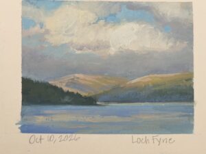
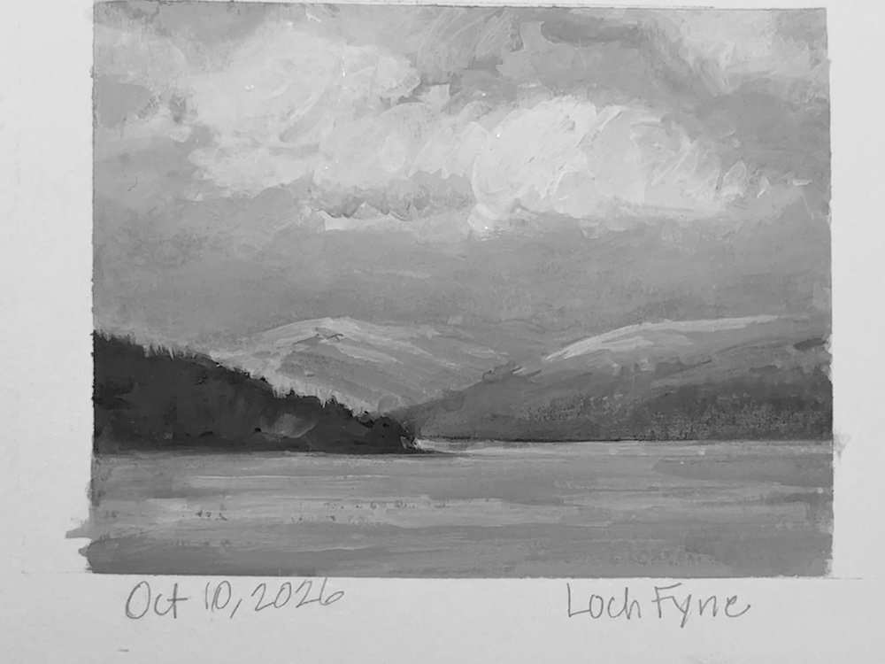
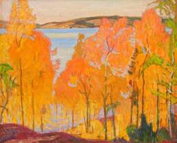
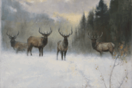
Notice how the color disappears, but the large light and dark masses still hold the composition together.
SIMPLIFY EVEN MORE
A black-and-white photograph may still contain many subtle gray values. The next step is to reduce those values into just three or four large groups. This is where painting becomes design.
You are no longer copying every shift you see in nature. You are deciding which values belong together so the painting reads clearly.
A Simple Exercise
Before your next painting:
1. Photograph the scene.
2. Convert it to black and white.
3. Squint and identify the largest value masses.
4. Make a small 3- or 4-value thumbnail.
5. Compare the thumbnail with the photograph.
6. Then begin painting.
The more you practice simplifying value, the easier it becomes to see those relationships directly in the landscape.
Remember: Color attracts the eye, but value gives the painting its structure. That’s why I believe value is more important than color!
When you learn to compare rather than guess, and simplify rather than copy, the landscape becomes much easier to organize.
And when the value structure works, you have much more freedom with color.
Happy painting!