 Nowadays, most artists use reference photos for their studio landscape paintings. We all know that good photographs are a handy tool which can be used to create a compelling landscape, figurative or even an abstract painting.
The problem is knowing how to choose and use a good photo. This is an important step to the success of your finished painting. Problems can arise when the artist relies too heavily on photographs for their soul inspiration because photos obviously lack the depth, value, color and saturation of reality.
For instance, the beautiful colors and details of a shadow are generally lost within a photograph, as explained below in Rusty’s demonstration. This is why most professional artists make outdoor plein air sketches of their landscape subject, along with reference photographs to be used in the studio. I know from experience that those little plein air studies are valuable color and value reference photo material for a studio landscape.
My Facebook friend and talented landscape painter, Rusty Jones explains how to use and not use a photograph as reference material for a studio landscape painting. I am sure you will really enjoy seeing how he combines photos and paints a masterpiece!
Guest artist/author: Rusty Jones
Today, I finished a large 24″x36″ oil on linen landscape painting and in the process realized it represented the best and worst of using reference photos for paintings. If this painting been a smaller piece, like a 12″ x 16″, the problems of using photo reference would not have been so significant. But, in a larger piece, the problems are compounded because there is so much more to say.
A single stroke can represent an entire tree in a small painting however, in a larger painting the artist must clearly define that same tree. Plus, it’s not just the tree that needs defining, but the ground around it and anything in front of or behind it. Before I get too verbose, its time to show images so I can better explain myself.
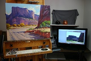
Let’s start with my setup:
- My palette is to the left of the easel.
- From where I stand in front of the easel I can easily view my reference on a 42″ HD monitor.
- The monitor is plugged into a laptop where I keep all of my photo reference.
- I have Photoshop on the laptop to manipulate photos (more about this later).
- On the easel is the completed painting. Notice the still life setup in the back on adjustable shelves so I can paint at eye level or lower depending on what I’m painting.
When to Use Photos as Reference. The Good:
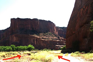
- This shot from Canyon De Chelly is the basis for my painting.
- Without photo reference the opportunity to produce this painting would not exist.
- So this is the good part of using photos to paint from.
When NOT to Use Photos as Reference. The bad:
Here are the problems with painting from this photograph and why you cannot rely on photographs as reference for my painting.
- First there are two lead-ins into the painting indicated by the red arrows in the photo below.
- One of them will have to be eliminated so I can control how the viewer enters the painting.
- Next the cliff on the right is so dark on my monitor I cannot make out any details so I will rely on one of my sketches from the trip.
- This is why painting from life is so important.
- Without the outdoor studies, or plein air pieces I did on the trip, I would have no idea how the reflected lights look, what colors and values are in the shadow side of the cliff or how to portray the true character of the cliff.
- I want to control how the viewer enters my painting and how they travel through it, so I need to replace the right side lead-in with something else. Searching my Canyon De Chelly folder I find the reference below.
 I decide to place this at the bottom right of the canvas. Now, I have eliminated one of the lead-ins and feelin control of the design.
- Sometimes I will take the time to take both photos into Photoshop and splice them together, but today I’m ready to paint and don’t want to take the time.
- Instead I just put both images up on the screen and draw them together to start the painting. Notice that I have made sure the light is coming from the same direction in both images.
- I decide to tackle the problem of the dark cliff and the new lead-in reference first, figuring I’d better solve these problems or this painting is going to be a huge waste of time.
Here’s a detail of the right cliff and foreground element. Resolving this problem was a two hour process. Satisfied I move on to the distant cliffs.
Feeling confident that I have resolved all design issues I paint the distant cliff and ground in about an hour.
(detail)
(detail)
Time to wrap things up by putting in the dirt road and sky.
The completed painting (4 1/2 hours later). I’ll wait a few days for it to dry then go over the entire painting with Liquin and touch up areas that I feel need to changed…or not. All-in-all a good day in the studio.
*****
For over 30 years, Texas based artist Rusty Jones illustrated for Golf Illustrated, Golf Magazine, Coca-Cola, the Dallas Cowboys NFL team, Dallas Mavericks NBA team, just to name a few. Rusty now focuses his artistic skills painting the Western American landscape. Rusty travels throughout the country painting the landscapes before him. To learn more about Rusty, visit Rusty Jones Studio .
Thank you to Rusty for sharing this important lesson with us! It was really fun seeing how you pieced it all together and made such a beautiful painting. ~Lori 🙂
*****
Top 10 Reference Photo Tips for Artists
Survival Tips for the Outdoor Painter & Enthusiast
Plein Air Painting with Utah’s Finest
How to Build a Pochade Box from a Cigar Box
How to Paint for Painting: Tips for the Artists Flying by Plane or Car
New Zealand: Painting and Playing in the ‘God Zone’
Bringing the Still Life to Life: A Painting Demo by Master, Jeff Legg
Read more: https://www.finearttips.com/?s=still+life#ixzz1EBtGyLc5




Thanks for sharing such valuable information. As a muralist just beginning to paint small canvases, I always struggle with wanting to change elements of a photograph, but not knowing how or even why. Rusty Jones really provided great detail, both written and visual, on how to accomplish this.
Debbie Viola
I am so glad this article helped you, Debbie. Rusty really used creative license and didn’t allow the photo to dictate his painting process. As I mentioned in the forward to the article. Too many artists rely on the literal interpretation of a photograph. Rusty’s demo was helpful in showing how NOT to use a photo!
Happy painting to ya!
Lori 🙂
Thanks for sharing my post Lori. I really enjoyed reading it again and the comments. You’re the best.
what type of monitor is he using?
Hi Sergio,
I am not sure, but will try and find out…
Thanks 🙂
The monitor is a Vizio 42″ HD TV with an HDMI cable to the laptop. Almost all TVs come with HDMI now. I adjust the setting so the color on the monitor matches my laptop. Hope this helps.
Rusty Jones
Hey Rusty!
Thanks so much for answering this question. I was going to FB you today and ask you…but, now I don’t have to! I looked at the Vizio monitors at Best Buy a while back, they are nice.
Again, thank you-
Lori 🙂
You said it best — he shows how NOT to use a photograph, and it was extremely helpful.
Hello Debbie,
Yes, Rusty did a great job explaining how NOT to use photographs. I am glad this article helped you.
Lori 🙂
Great article!
Hi Lori,
Such a wealth of information on your site, however extremely irritating to navigate with an iPad as your have a drop down window at the top that blocks 1/2 the page and at the bottom you have another pop up with all your social media links, so one is compelled to view this tutorial through a tiny slither of space left on the iPad screen. Please view your website through an iPad so you can see what I mean. Thanks though for the excellent tips on your site.
Hello Amanda, my apologies for the extremely belated reply. I hope by now my site is more mobile friendly!