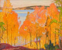
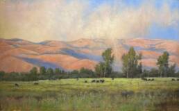
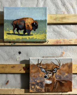
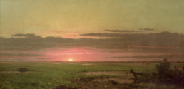
One of the biggest artistic breakthroughs came when I finally understood aerial perspective —how distance affects color, light, and detail in a landscape painting.
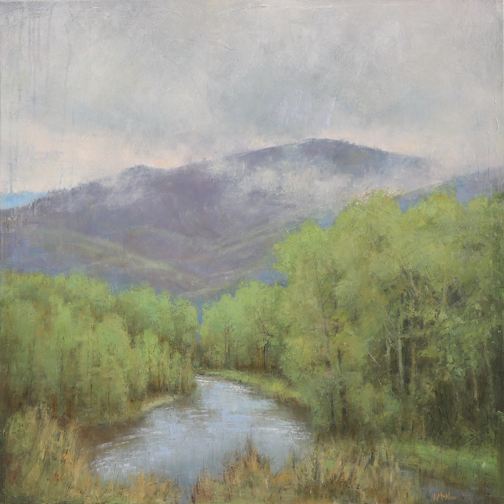
It was a game-changer. Once I started applying these principles, my paintings became more believable, lifelike, and full of depth. Suddenly, those far-off mountains receded gracefully, blending into the atmosphere.
If you’ve ever struggled to make your landscape paintings feel expansive and alive, mastering aerial perspective (aka atmospheric perspective) might be the key you’re looking for. Let’s explore how to mix the right tones (colors) and create that beautiful illusion of depth.
1. How Distance Changes Colors
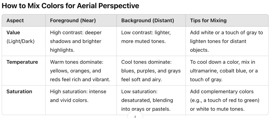
With aerial perspective, colors shift as they move further away:
Value: Objects in the distance appear lighter because atmospheric haze reduces contrast.
Temperature: Distant colors cool down as warm tones (like yellow and red) scatter in the atmosphere.
Saturation: Colors lose intensity, becoming more muted and blending into the air.
This gradual shift makes the world feel bigger on your canvas. Once I started softening my distant greens with cool blues or grays something clicked. My backgrounds harmonized with the foreground—they started working together.
2. Mixing Colors for Distant Depth
Here’s where the aerial perspective magic happens! Mix your paints to mimic these subtle changes.
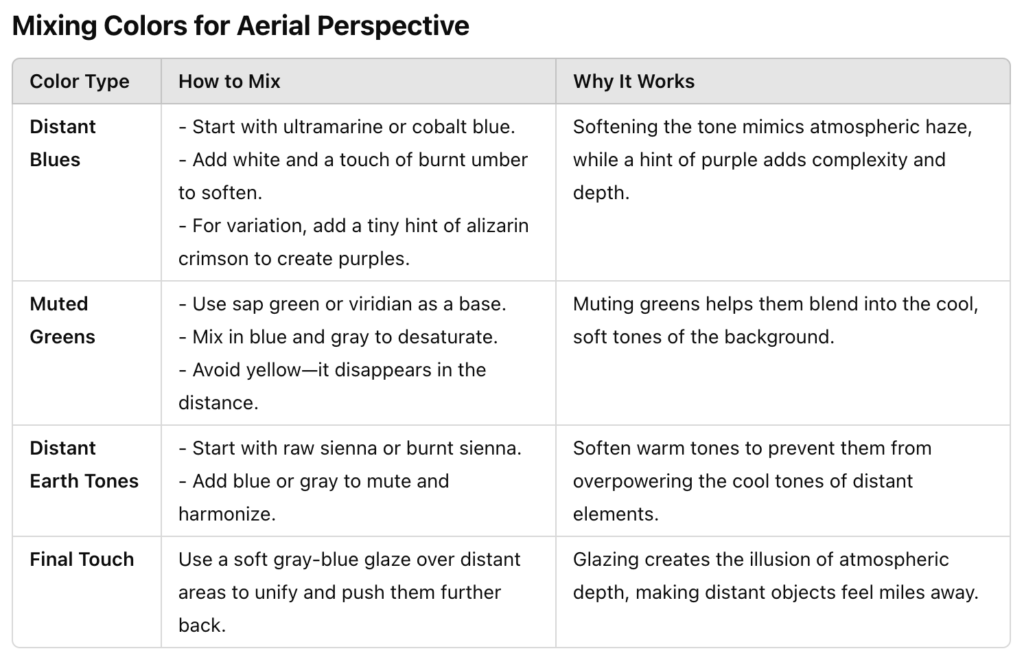
- For Distant Blues: Use ultramarine or cobalt blue with a touch of white and burnt umber to soften the tone. Adding a tiny hint of alizarin crimson or madder lake can create purples for variation.
- For Muted Greens: Start with a base green like sap green or viridian, then mix in blue and gray to neutralize. Add less yellow as it tends to disappear as it recedes with distance.
- For Distant Earth Tones: Soften and neutralize raw sienna or burnt sienna with blue or Payne’s gray to create harmonious, muted shades.
These small adjustments make a huge difference. I remember the first time I used a soft gray-blue glaze over distant mountains—suddenly, they felt like they were miles away, not awkwardly hovering near the foreground. - Limited Palette: Try using a limited palette to simplify and create better color harmonies!
3. Transitioning to the Foreground
As you move closer to the viewer, your colors should become richer, warmer, and more saturated. Think of it as turning up the volume:
- Add warm tones like yellow ochre, cadmium red, or burnt umber to your palette for the foreground.
- Increase contrast and sharpness—shadows in the foreground should be darker and crisper compared to the soft, hazy shadows in the background.
- Use texture sparingly in the distance but freely in the foreground to enhance the sense of space.
This transition was a revelation. By warming up the tones in my foreground, everything popped to life while keeping the background soft and serene.
4. Balance Warm and Cool Tones
A big lesson I learned was how to balance warm and cool colors.
While distant objects are cooler and foregrounds are warmer, there’s often a gentle mix of both. Adding a touch of warmth to a distant area or cooling down a shadow in the foreground can create a harmonious flow that feels natural and immersive. It’s a balancing act! It also helps to harmonize the painting as a whole.
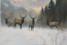
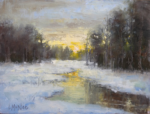
*Note: Of course, there are some exceptions to the rules. Sometimes in winter scenes, the transitions can be reversed! In COLD LIGHT above, the snow gets warmer in the distance as it nears the sunlight, and cooler in the foreground!
5. Glazing and Scumbling for Atmosphere
To heighten the effect of aerial perspective, try using thin glazes and scumbles:
- Apply a light blue-gray or lavender glaze over distant areas to create a unified atmospheric look.
- Work with muted greens or soft purples in the mid-ground section to transition smoothly.
- Build opacity and texture in the foreground for richness and clarity.
- Read more about this process Scumbling & Glazing Tips
When I first started glazing, it felt like magic. A few thin layers could transform a flat scene into something ethereal, almost like the viewer can step into!
6. Learn from the Masters
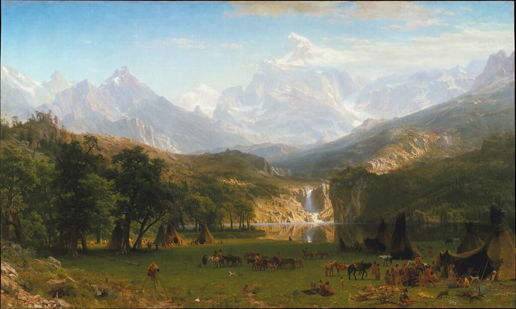
When I wanted to deepen my understanding of aerial perspective, I turned to great landscape painters from the past. Artists like J.M.W. Turner and Albert Bierstadt showed me how to use atmospheric effects to enhance depth. Turner’s hazy skies and Bierstadt’s vast, layered mountainscapes are perfect examples of how distance cools and softens colors.
If you’re looking for inspiration, I recommend studying:
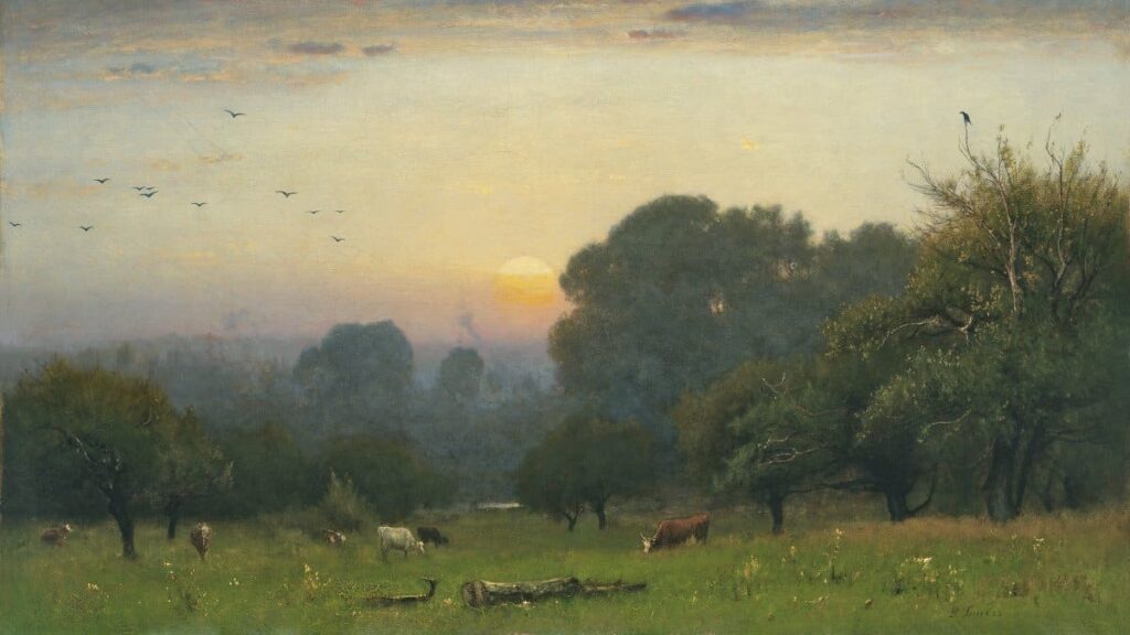
Inness’s “Morning” for its muted, moody, distant hues.
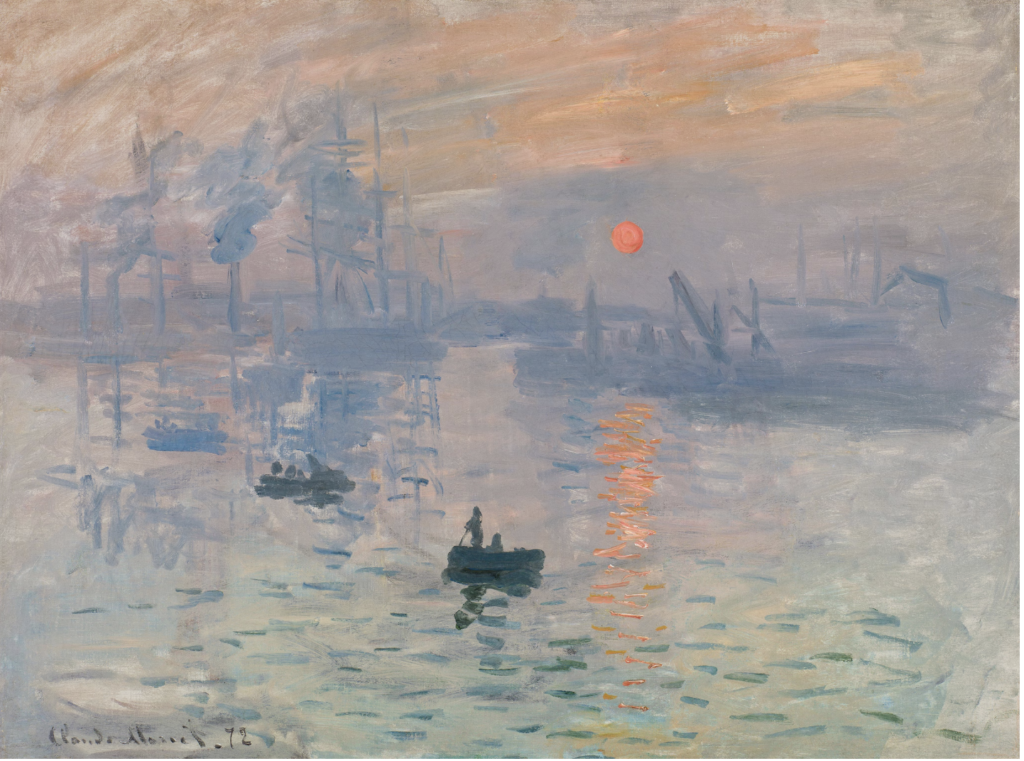
Monet’s Impression, “Sunrise” for its subtle atmospheric transitions.
Bierstadt’s “The Rocky Mountains, Lander’s Peak” to see how cool tones dominate receding layers.
For me, aerial perspective was the missing piece that brought my landscapes to life. It’s not just about technical accuracy—it’s about storytelling. By understanding how color shifts with distance, you can guide your viewer’s eye and create expansive scenes that feel alive.
So next time you’re at the easel remember how distance can transform your painting. Soften those distant tones and edges, let your foreground shine, and watch your landscapes grow more believable!
PS. Checkout my online courses at “Lori’s Fine Art Tips School” and use the discount code XSpecial30 to SAVE 30%


