I often enjoy painting with a limited palette. A while ago, I limited my palette to only complementary colors using the ancient 5000 year old Chinese philosophy, the ‘balance of opposites’ or Yin & Yang.
After reading The Yin Yang of Painting I was so inspired by the artist, Hongnian Zhang, I decided to give this approach a try. I was pleased with my first attempt and wrote a blog post about the process: A Unique Approach to Improve Paintings Using Color Harmony
Here’s a crash course:
Everything in nature has its opposite. For example:
- moon/sun
- black/white
- day/night
- sunrise/sunset
Every color has its opposite too! Each ‘primary’ color or hue (red, yellow, blue) is directly opposite a ‘secondary’ color (green, purple, orange).
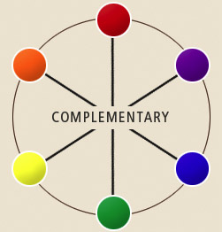
These complementary colors are always found opposite each other on the color wheel:
-
Red – Green
-
Yellow – Purple
-
Blue – Orange
In the chart below, you can see each primary color is opposite its complementary color.
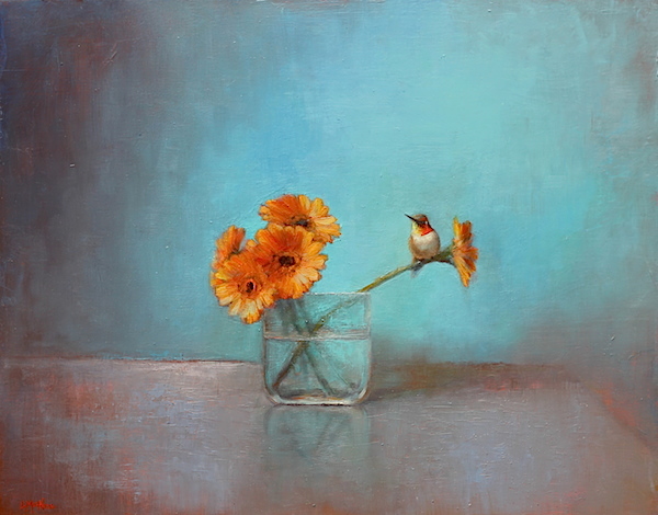
In the painting above, “A Bit of Summer,” I used a palette with blues and oranges. This combination feels pleasing to me.
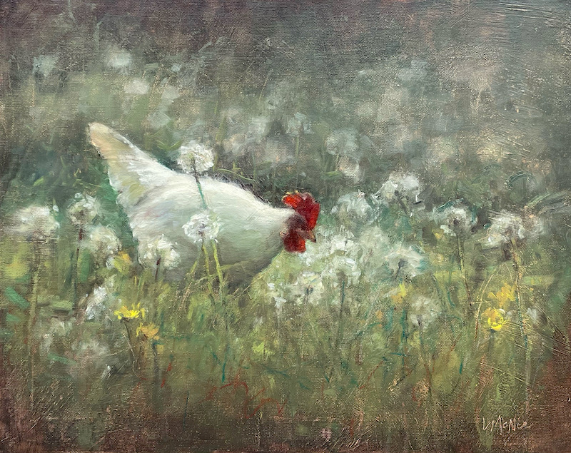
For my painting “Backyard Chicken,” I used a limited palette with complimentary yin/yang colors of Green and Red. Notice how the painting has a lot of variations of green tones with a pop of red! I intentionally used the complimentary red to accentuate the focal point of the chicken. I like how they both turned out!
It actually easy to achieve an incredible variety of rich colors and muted grays that are found in nature using the limited palette. Give Yin/Yang painting a try!
If you enjoyed this article you might like to read:
Use the Hidden Meaning of Color to Improve Paintings
The Importance of Value & Tone in Painting
A Unique Approach Using Color Harmony to Improve Your Paintings
~ Lori




Wow this is a great resource.. I’m enjoying it.. good article
With a name like ‘robot’ I am not sure if you are ‘spam’ or not – lol… Glad to help.
L
Amiable post and this mail helped me alot in my college assignement. Thanks you on your information.
Glad to help!
Lori 🙂
Lori – I see so many paintings at art shows that I am particulary drawn to and it turns out that they often use limited palettes. I am going to try those colours and see how my art turns out.
I enjoy your website and blog.
The limited palette has been a lot of fun to experiment with lately. I find that when I use complimentary colors in my work, the painting has an extra harmony that is not as easy to capture with the extended palette. Dale, thanks again for your great comment.
Happy painting-
Lori
Hi Lori,
I recently came across your blog and have read articles. This one hit home, today in my pol paintingclass a fellow student was about to start a new painting and wasn’t quite sure how to tackle the question of which colors,. I took one look at it and it screamed orange and blue! She proceeded to start the painting with my suggestion and voila, she nailed the color and was so happy with her painting!
Yours in art,
Peggy
Hello Peggy. This is a great little story that you shared. I am so happy my article helped you. It really has been a fun way to make harmonious works. If you ever have a tip to share, I’d love to see it.
Cheers-
Lori
Lori, when I first read this article, i thought you were going to use actual, honest to goodness primary colors, not variations, and i was thinking ‘is she doing abstract art or something, because otherwise it will look like a kids painting (but a very GOOD kid’s painting, don’t get me wrong) so in my opinion you kinda cheated, but I love your painting any-who!
Love, unicorns, and candy canes,
iloveteddybears999
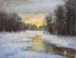
HI Lori – I used your limited palette of purple and yellow today and painted a snow scene from my porch. I really think using your palette suggestion made the painting come together fast…which was good since I needed to go inside after 1 hour to get warm. Thanks again – Mary Beth
Hello Mary Beth, it was a fun experiment and I loved the results. I hope you give it a try. 🙂
Hello Lori-just found this post and it was very relative to a discussion on painting with complimentary palettes at Virtual Art Academy. I liked your listing of colors used and was wondering if you could recommend a mix of colors for a red-green palette. Also, when you say you select a “true” compliment, can you explain how you determine the true compliment. Thank you so much.
Hello Kevin. True compliments are the colors opposite each other on the color wheel. Modern color theory uses either the RGB additive color model or the CMY subtractive color model, and in these, the complementary pairs are red–cyan, green–magenta, and blue–yellow. In the traditional RYB color model, the complementary color pairs are red–green, yellow–purple, and blue–orange. I hope this helps!